
Thoughts on soy milk packaging design, a discussion with food business owners: the original design starting point for soy milk was "even if you're drinking alone, it should be done right" — this is the most real change in marketing!
What's actually hard about marketing in 2026? I think the difficulty is in direction, not execution. A while back I read an analysis with a data point I went back to several times: one conclusion I'd like to discuss with everyone!
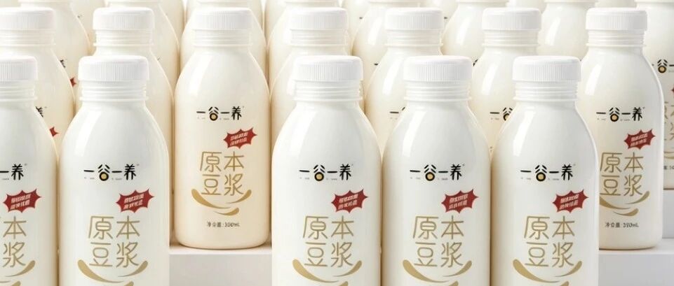
Where is the real difficulty in marketing? I think it’s in the direction, not the execution.
A while back I read an analysis with a data point I went back to several times: China’s single adult population exceeds 240 million. This doesn’t mean everyone has stopped getting married — it means the basic unit of consumption has changed, from “the family” to “one person.”
Eating alone, drinking alone — what you’re after isn’t “big portions that fill you up,” it’s “I’m going to eat a little better this meal.” One person still wants wagyu, still buys scented candles, and even a single person drinking soy milk wants to drink it with some care.
We did packaging for a soy milk product. The client’s brief was remarkably simple: clean. A white bottle, a white label, nothing extra drawn on it. Someone on the team muttered at the time, isn’t this too plain? How’s it going to hold up on the shelf against all those colorful ones?
But then we figured something out: this generation of consumers has seen too much packaging. They aren’t drawn in by the flashy stuff — they stay for what’s “real.” The beauty of a white label is that it hands the job of saying “this is a good bottle of soy milk” to the beans and the craft. The packaging doesn’t steal the scene.
Held in your hand, the bottle is clean white, the natural color of the soybeans showing through, and the label carries just one line of information: the four large gold characters “原本豆浆” (Original Soy Milk). No function claims, no exaggerated selling points. Just a tiny red badge pressed into the corner reading “物理研磨” (physical grinding) — those four characters alone convey the confidence in the craft.
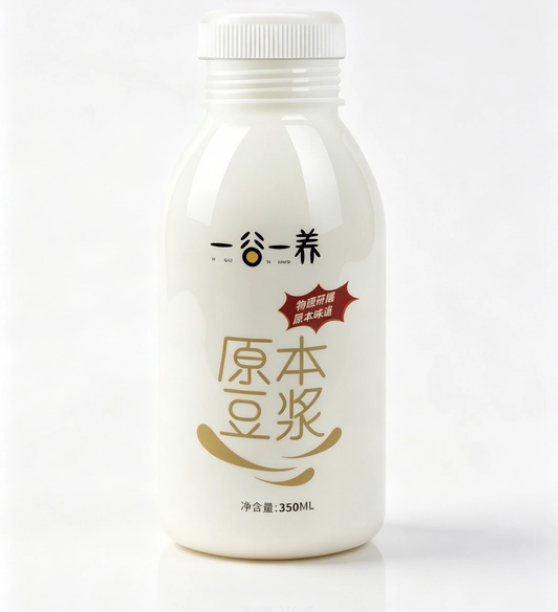
— 一谷一养 Original Soy Milk single-bottle display
That “物理研磨” badge was something we honed with the client over and over. At first he wanted to write “traditional stone mill, ancient method” — I said no. Stone mill is a nostalgia word; to young customers it sounds like a story from the older generation. “物理研磨” is a down-to-earth description of the craft: those who know, get it at a glance; those who don’t still read it as professional. He later had someone verify the process specifically, and only put it on once he was sure he dared to print it.
We also cleaned up the label layout over several rounds: the trademark at the very top, the gold “原本豆浆” as the star, white space in the middle, and a line of small text below for ingredients and specs — nothing competing with anything else. The client said the label looked “quiet.” I said exactly — that quietness is the whole point.
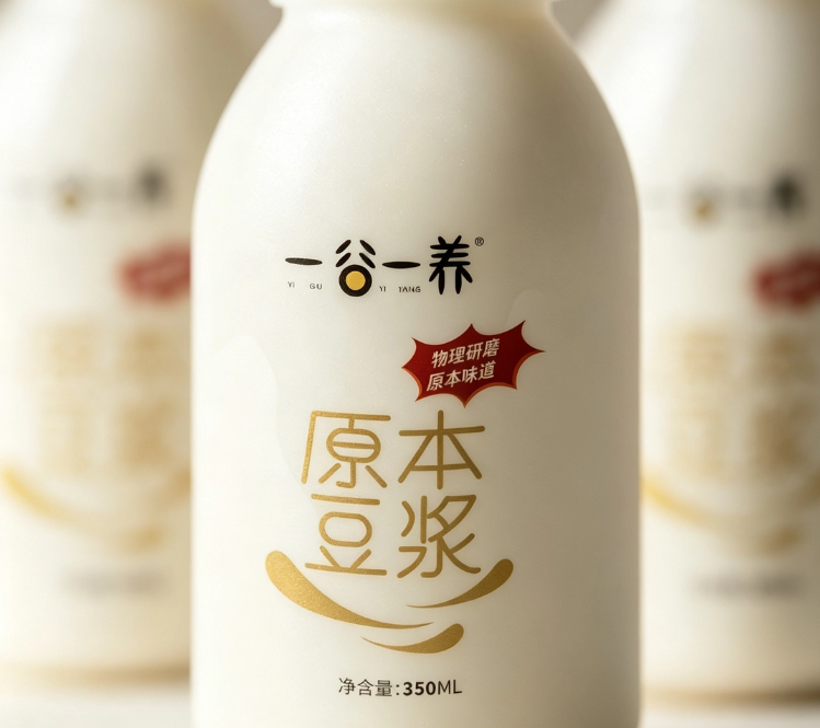
— 一谷一养 Original Soy Milk detail close-up
Later the client reported back: many customers, the first thing they do after buying it is take a photo and post it to Moments, with the caption “this soy milk looks like it tastes good.” See — once the underlying logic of marketing changes, it’s the plainest expression that moves people most.
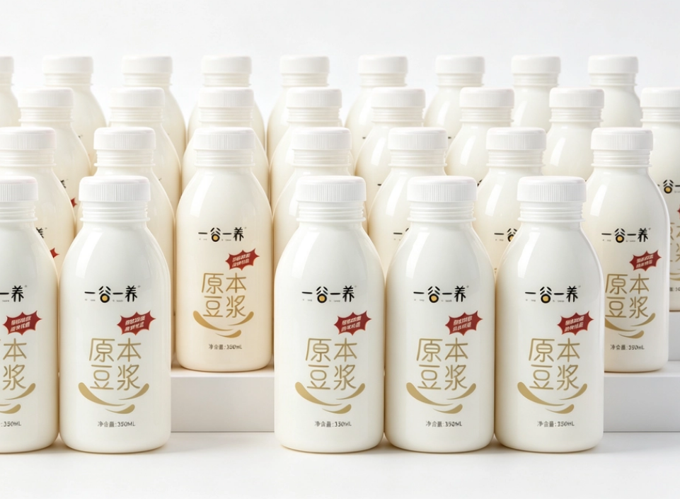
— 一谷一养 Original Soy Milk multi-bottle array
We used to pile selling points onto packaging; now we’d rather subtract. Make the product itself well, let the packaging step back, and let customers discover the good on their own. This shift, I think, is the most concrete change in marketing — it’s not that marketing matters less, it’s that marketing has finally returned to the place it should stand.
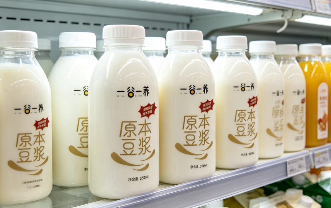
— 一谷一养 Original Soy Milk shelf display
Drinking with care even when you’re on your own isn’t being precious — it’s the standard of living this generation has set for itself. What packaging has to do is live up to that care, not hold it back.
Sanyao Packaging
Good packaging speaks for itself
About This Case: Quick Answers
Everyone in the same category stacks their shelf space to the brim — how do we break out?
When everyone else is adding, you stand out by subtracting. Keep only the three most essential things on the main face: the big category word, one instantly memorable symbol, and one detail that anchors trust. Getting people to recognize who you are from three meters away is far more useful than printing the whole orchard across the bottle.
The beverage approach in this article — can it work for my beverage product too?
Yes. This logic doesn't discriminate by category — it works as long as your product looks like everyone else's on the shelf and consumers can't recognize you in three seconds. When it comes to execution, we'll redefine the plan around your category, channel, and price band rather than forcing someone else's face onto yours.
If I hire you for beverage packaging, how do you usually charge, and how long does it take?
We charge per project, depending on category complexity, the number of series, and whether prototyping and extensions are included. Typically 2–4 weeks: the first week sets direction and positioning, the second week delivers concepts, and the third and fourth weeks deepen, prototype, and finalize. Rush jobs can be compressed, but we recommend leaving time for physical prototyping. Send us your materials for a free diagnosis first, then we'll quote.
We're based out of town — can we work together online?
Yes. Many of our projects are remote collaborations: materials coordinated online, concepts reviewed in the cloud, prototypes shipped by courier. There are no geographic limits — we work with clients nationwide.
CommentsBe kind, communicate rationally