
Warm Encounters: Three Things I Learned from lululemon — Small Brands Can Do Integrated Marketing Too
A look at an integrated marketing case I've studied over and over: lululemon's "Together in a Good State." It really comes down to three things. One core theme: person-to-person
Let me share an integrated marketing case I’ve studied over and over: lululemon’s “Together We Get Well.”
It really comes down to three things. One core theme: human connection and well-being. One standard process: each year, first publish a well-being report, then hold events, invite celebrities, and run fitness classes on the ground. And then one thing—persistence. Every year on October 10th, without fail, for five years running.
See, there’s nothing fancy about it. Its power lies in “focus × repetition”: the theme never changes, but the execution evolves each year. Consumers see it every year, and gradually it becomes a conditioned reflex—“it’s that time of year to check in on my own well-being.”
What does this teach us, as people who do packaging? I used to think integrated marketing was a big-brand thing. Then it clicked: it’s really just the ability to “define a group of people, then speak to them repeatedly in a consistent way.” Small brands can do it too—just with a different vehicle.
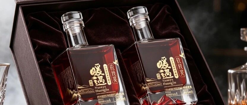
For example, we did packaging for a huangjiu (yellow rice wine). This category has an awkward problem: young people see it as “the drink old folks have.” The client wanted to reach the youth market without losing its warm, healthful heritage.
We ended up creating a square-bottle, light-luxury version called “Warm Encounter” (Nuanyu)—a crystal-cut square glass bottle, a geometric crystal cap, and a ring of golden landscape patterns around the body that shift as the light hits them. It looks like a design-forward fruit wine, but one sip and it’s still that warm huangjiu.
The fun part was the bottle base: we embedded a three-dimensional red mountain peak inside it. Pour in the wine, and the mountain “floats” in the amber liquid, glowing through from the bottom.
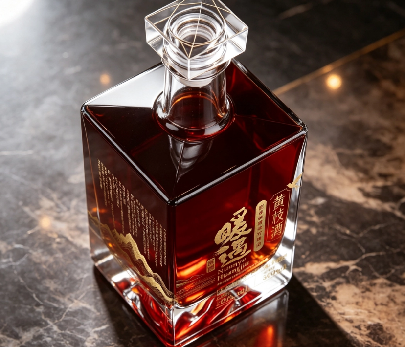
— Crystal-cut square bottle with geometric cap
It didn’t force trendy gimmicks on young people. Instead, it made the word “warm” its own theme: warm wine, warm drinks, warm encounters—the “encounter” kind of meeting. The matching gift box is in brown-red tones, with a gold mountain motif stamped on the lid that echoes the mountain in the base—open the box and there’s a mountain; pour the wine and there’s a mountain too.
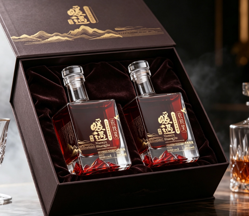
— Two-bottle gift box with gold-stamped mountain motif
And then? Packaging is only the starting point. True integration is when everything the brand does afterward revolves around “warm”: social copy that talks about warmth, offline events that create warm gatherings, even after-sales cards written like letters from a friend. Over time, whenever consumers think of that warm, healthful, cared-for feeling, they think of this brand.
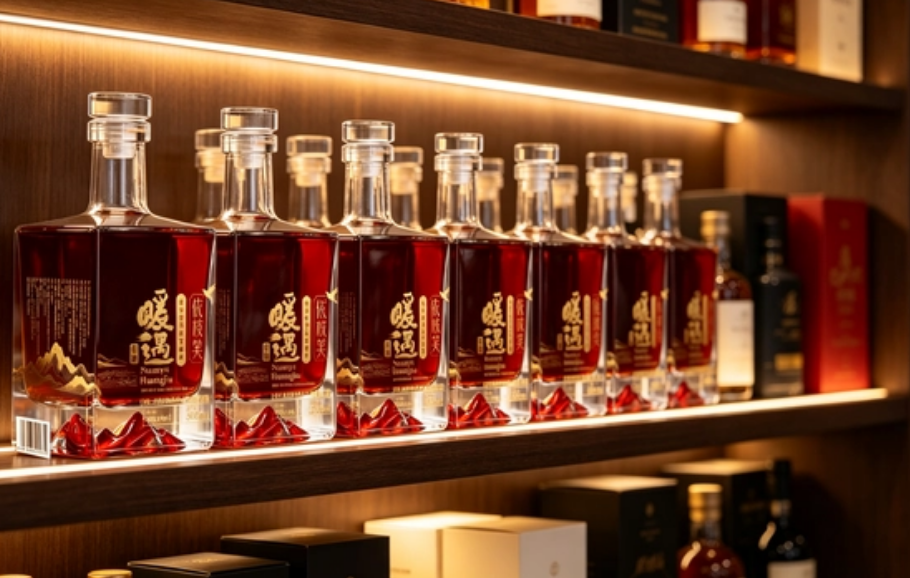
— Detail of the red 3D mountain peak embedded in the bottle base
That mountain in the base became the most-photographed part of the bottle. Someone posted on social media, “There’s a mountain in the wine,” and the comments were full of people asking for the link. One small design detail worked better than ten ads.
That’s what I learned from lululemon: first set a theme that doesn’t change, then let it appear again and again in all kinds of ways. The creative can change; the theme must not scatter. Packaging, content, events—they’re all different ways of saying the same sentence.
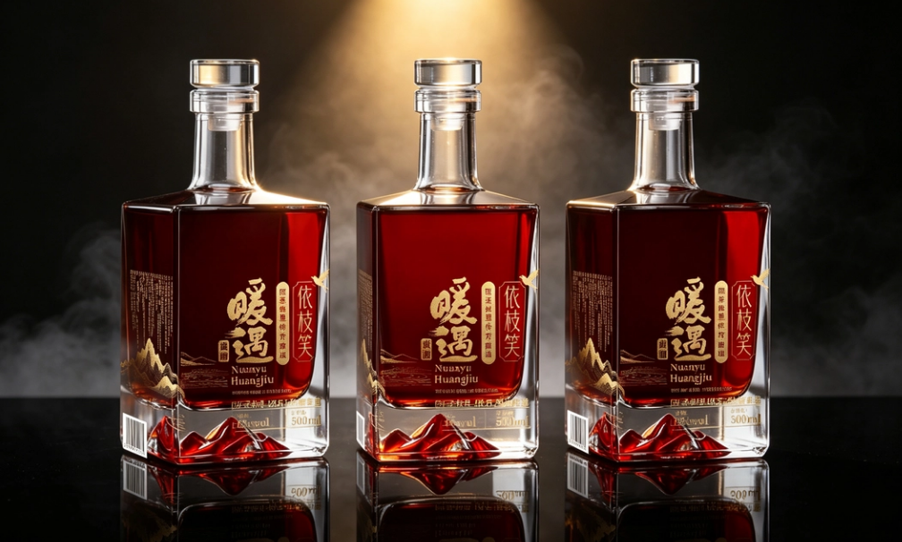
— Three-bottle array display on black background
Once the theme is set, all that’s left is to keep saying it.
Sanyao Packaging
Good packaging speaks.
About This Case: Quick Answers
Can this "where baijiu gets photographed most" approach work for my product too?
Yes. This logic isn't picky about category—it works as long as your product sits on the shelf looking like everyone else's and consumers can't recognize you in three seconds. When it comes to execution, we'll define a new plan based on your category, channel, and price band rather than forcing someone else's face onto yours.
If I hire you for product packaging, how do you usually charge, and how long does it take?
We bill per project, depending on category complexity, the number of series, and whether prototyping and extensions are included. Typically 2–4 weeks: week one sets direction and positioning, week two delivers the concept, and weeks three and four refine, prototype, and finalize. Rush timelines can be compressed, but we recommend leaving time for physical prototyping. Send us your materials for a free diagnosis first, then we'll quote.
We're based out of town—can we work together online?
Yes. Many of our projects are remote collaborations: materials coordinated online, concepts reviewed in the cloud, and prototypes shipped by courier. There's no geographic limit—we work with clients nationwide.
Is packaging a cost or an asset?
It's pricing power. Treat it as a cost to cut, and it gets deducted from your selling price; treat it as an investment, and it tells your story of value before consumers even reach for their wallets. Good packaging does just one thing: it makes the product look—and genuinely be—worth that price.
CommentsBe kind, communicate rationally