
Baijiu with its own character and packaging design with its own personality — that's what makes baijiu packaging sell!
A baijiu packaging case study featuring a matte black bottle with gold calligraphy — from shelf display to personality-driven brand positioning, we break down how packaging helps a bottle of liquor get noticed in a red ocean.
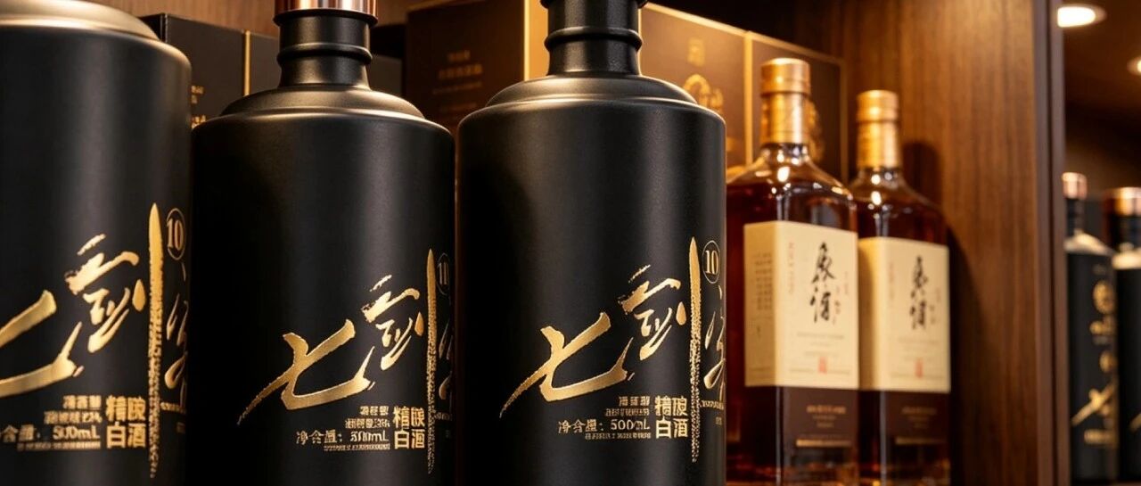
You want to know how fiercely baijiu packaging has been competing these past two years? Just take a trip to a liquor store and you’ll see. Red bottles, gold bottles, dragon patterns, embossing—each one more “prestigious” than the last. Standing on the shelf and looking from three meters away, it’s all the same festive red. The brands feel wronged too: “We’ve changed the bottle three times, spent a couple hundred thousand on molds, and sales haven’t budged—and the ad agency is still telling me to ‘upgrade it one more round.’”
So where’s the problem? If I may offend some people—most brands approach packaging as a “single-point creative idea,” not a “business strategy.”
What do I mean by single-point creative idea? It’s thinking “packaging = a good-looking bottle.” The design mockup looks gorgeous, the concept is explained eloquently, but once it’s on a real shelf, handed to a consumer, and placed on the family dinner table—can it speak for you, stop people in their tracks, sell one more bottle? Nobody has thought about that.
Recently I’ve been staring at a baijiu called “Seven Swordsmen” for a long time. It doesn’t have any earth-shattering creative idea; you could even call it plain—a black frosted bottle, a metal cap, a line of gold-stamped calligraphy on the bottle, and that’s it. But it has turned “packaging” into a complete chain from shelf to dining table. Today I’ll use it to break down that chain.
01
From concept down to earth, to reporting for duty on the shelf
Anyone who does design knows the gap: the rendering is perfect, the prototype is disappointing, and on the shelf it’s unfamiliar.
Many packaging projects die at the second hurdle. The designer draws a bottle gleaming with gold, the brand thinks it’s “premium,” but the printer tells you the gold-stamping area is too large and prone to edge cracking, the frosted material easily picks up fingerprints, and the bottle shape is too irregular so the production line needs new molds—every sentence is a budget item. The final compromised product and that stunning rendering are basically two different things.
My first impression of the Seven Swordsmen case was “restraint.” A black matte bottle, no large areas of gold, no embossed dragon, gold stamping only on the calligraphy—small area, stable process, controllable cost. It clearly first thought through “this thing needs to be mass-produced and go on the shelf,” then went back and did the design—rather than drawing a cool picture first.
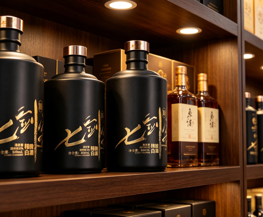
— Seven Swordsmen - shelf display
Look at this real shot. Warm spotlights hit the dark wooden display shelf, the bottle is nestled among a curio cabinet, next to a blue-and-white porcelain vase, a thread-bound book, and a teapot. Honestly, at first glance I even thought the blue-and-white vase next to it was more eye-catching—black frosted doesn’t “pop” against a dark background; it relies on that bit of sheen from the spotlight. But precisely because of that, it doesn’t compete with the shelf for attention; it blends into the overall atmosphere of “Chinese, old-school, substantial.” The shelf is its stage, not its enemy.
02
A packaging workflow: from shelf to dining table in four steps
In the liquor category, packaging is actually a full chain from “seeing” to “finishing the bottle”: shelf display, hand-held presentation, personality positioning, and word-of-mouth accumulation. Seven Swordsmen’s breakthrough is that it strings these four steps together, each with a clear task.
◆ Step one, shelf display: make people see you first
Half of baijiu purchase decisions happen in those ten seconds in front of the shelf. Among a row of red and gold bottles, consumers’ eyes blur; they can’t really tell who is who. At that moment, an outlier outside the “red-gold system” gets a second glance.
Seven Swordsmen choosing black frosted isn’t rebellion; it’s strategy. Black naturally looks “expensive” on the shelf, and the frosted texture doesn’t reflect light or look cheap; the bottle shape is a stable square-shoulder round body that feels substantial in hand. It doesn’t shout, but among all that red and gold, its quietness stands out.
◆ Step two, hand-held presentation: make people willing to pick it up
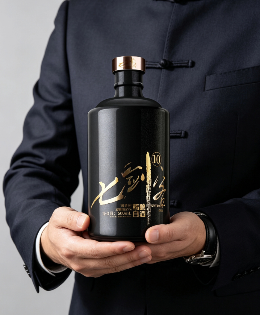
— Seven Swordsmen - hand-held
The second battlefield of packaging is the hand. In this real shot, a person in a dark Chinese-style mandarin-collar top holds the bottle with both hands, watch still on the wrist—this pose is deliberate: holding the bottle with both hands is “solemn,” it’s the gesture of “handing it to you to drink.” Think about it: baijiu drinking occasions are mostly toasts, gifting, and gatherings, and the bottle’s “feel” and “look” directly determine whether the host has face when bringing it out.
This is where the frosted bottle’s advantage shows: not slippery, steady in hand; gold on black, recognizable across the table at a glance. It doesn’t need you to say its name; what you remember is “that black bottle.”
◆ Step three, personality positioning: make people remember who you are
The watershed between single-point creative idea and business strategy is here. Good-looking bottles are everywhere, but bottles with “personality” are few.
The name Seven Swordsmen itself carries personality—swordsman: solitary, swift, fierce. The black frosted bottle + gold-stamped calligraphy translates “swordsman” into visuals: low-key, but with an edge. It’s not “prestigious”; it’s “jianghu spirit,” the role played when a few friends sit around a table.
◆ Step four, word-of-mouth accumulation: make people speak for you at the dining table
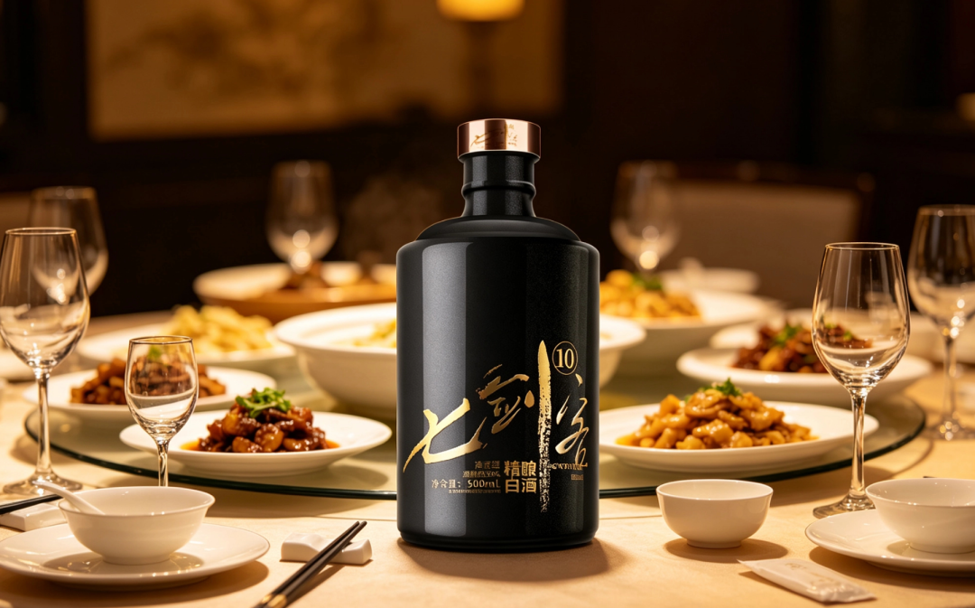
— Seven Swordsmen - gathering scene
Finally, the dining table. This real shot is a round table filled with Chinese dishes, glass wine cups, white porcelain bowls, warm light falling—a genuine gathering atmosphere. The bottle stands in the middle; no introduction needed—everyone at the table knows “today we’re drinking that black bottle.”
Packaging only closes the loop when it reaches this step: seen on the shelf, examined in hand, remembered at the table—and the next time they buy liquor, this is the bottle they think of. Word of mouth rolls around circle by circle like this—not by blasting ads, but by “that black bottle” on every dining table.
03
The endgame of packaging is a business of certainty
Many brands today still approach packaging at the “good-looking is enough” stage, and design agencies are happy to just deliver a rendering. But the shelf doesn’t lie: can a package make people in front of the shelf pause two more seconds, make hands hold it two more seconds, make people at the table chat two more sentences—that’s its real KPI.
I admit, just looking at the design mockup, Seven Swordsmen’s set isn’t stunning—it’s even a bit “too plain”: black bottle, gold calligraphy, pitifully few elements. But put it into real display, real hands, real dining tables, and it holds up. This isn’t luck; it’s because from the very beginning it made “business” the goal of design.
The next time you see a baijiu package, don’t just look at whether it’s pretty—ask these three questions: On the shelf, is it noticeable? In hand, is it comfortable? At the table, will it be remembered?
If it can answer yes, it’s called packaging. If not, it’s just a good-looking bottle.
Sanyao Packaging
Good packaging speaks.
About This Case: Quick Answers
Are finishing processes on packaging (foil stamping, matte coating, etc.) worth it?
Spending a few dimes to a dollar more per bottle buys you a texture that lights up instantly under the counter lights, and the gut feeling that "this bottle isn't cheap." Finishing isn't showing off technique—it's money spent to make consumers willing to believe it's worth the price, and that dollar comes back doubled in the selling price.
Can my baijiu product use this "Seven Swordsmen" playbook too?
Yes. This logic doesn't discriminate by category—as long as your product looks like everyone else's on the shelf and consumers can't recognize you in three seconds, it works. When it comes to execution, we'll redefine the plan around your category, channel, and price band rather than forcing someone else's face onto yours.
If we hire you for baijiu packaging, how do you usually charge, and how long does it take?
We charge per project, depending on category complexity, number of series, and whether prototyping and extensions are included. Typically 2–4 weeks: week one sets direction and positioning, week two delivers concepts, and weeks three and four deepen, prototype, and finalize. Rush timelines can be compressed, but we recommend leaving time for physical prototyping. Send us your materials for a free diagnosis first, then we'll quote.
We're in another city—can we collaborate online?
Yes. Many of our projects are remote collaborations: materials coordinated online, concepts reviewed in the cloud, prototypes shipped by courier—no geographic limits, and we work with clients nationwide.

CommentsBe kind, communicate rationally