
A Discussion of the Character of Beer Packaging Design: How to Find Packaging Design That Matches Your Product's Character Is the Better Choice
A friend of mine who makes craft beer complained to me: in today's beer market, every bottle is shouting "craft," "original brew," "German technique"—after three years of shouting, people still can't tell who's who
A friend of mine who makes craft beer was venting to me: in today’s beer market, every bottle is shouting “craft,” “original wort,” “German technique”—they’ve been shouting for three years, and people still can’t tell who’s who. He tried it himself, printing the entire brewing process all over the can, and a month after it hit the shelf, sales were flat.
So where’s the problem? Consumers don’t care about your wort concentration at all. What they care about is—does this bottle, in my hand, look like the real deal?
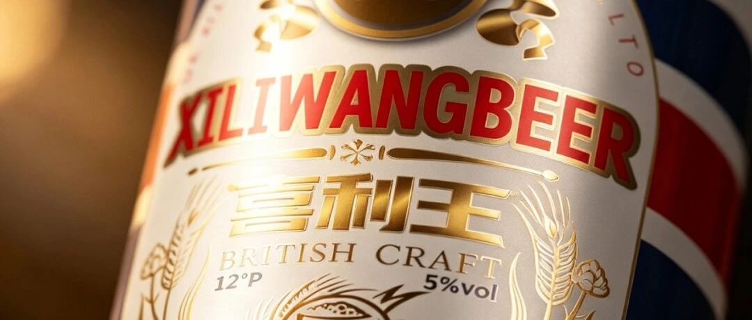
I only fully got this after looking at a set of British-style beer packaging. The brand is called “Xiliwang,” with both cans and bottles, going for a British retro look. Today we’re not talking about taste—we’re talking about how this packaging gets people to “half-believe it” before they even try it.
01
The can leads with a sense of “identity”
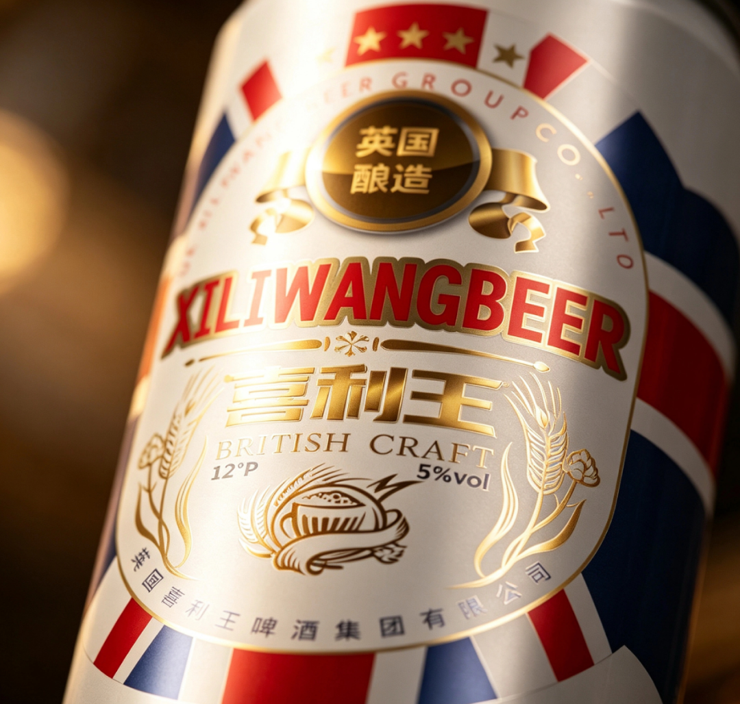
— Xiliwang - can close-up
Look at this can. White background, red and blue stripes, a big “XILIWANGBEER” in the middle, a ring of golden wheat ears around it. Put plainly, this visual language is familiar to beer drinkers the world over—the Union Jack, red-white-and-blue, wheat ears. Set it down and your first reaction is, “this stuff is from Britain, it’s legit, it’s an old brand.”
What are consumers buying when they buy beer? They’re buying the psychological cue that “this will taste reliable.” The words “British brewed” are the easiest trust signal there is. You say your beer uses the finest malt—consumers can’t verify that. You say you come from the British beer tradition—the picture in their head appears instantly. This isn’t deception; it’s translating “quality” in advance into a language consumers understand.
Honestly, at first I thought this was just a matter of slapping on a flag, nothing technically impressive. But looking closely at their product matrix, I realized it’s not—the bottles have their own British logic, the cans have their own drinking occasions. They’re genuinely building “British identity” as a system, not just slapping on a label.
02
The real killer move: letting “identity” walk into real occasions
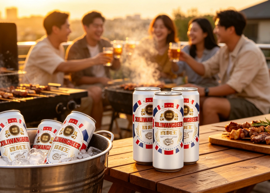
— Xiliwang - toast at a gathering
I looked at this image for a while. Silver cans on a wooden table, a group of people raising glasses and laughing in the background, cups scattered across the table—clearly a gathering of friends. This scene is really clever: it’s not shooting “how good the beer tastes,” it’s shooting “bringing this can out to a party won’t embarrass you, it has face, and it even makes you look like you have taste.”
Notice this: more than half of beer purchase decisions happen in the moment of “what beer do I bring to entertain my friends.” At that moment, a can printed with the Union Jack that feels like an import in your hand, versus a domestic white-label bottle that’s actually just as good—most people will pick the former. This isn’t worshipping foreign things; it’s that people have a natural trust in familiar cultural symbols.
There’s another image I like even more—the can just pulled out of an ice bucket, condensation beading on the surface, summer-night light spots in the background. Look at that condensation—it’s more persuasive than any ad slogan: “I’m iced, I’m fresh, I’m the sip you want in summer.” A lot of brands never even think about this detail when designing packaging, but consumers see all of it.
03
Cans and bottles, two lines, turning “British” into a combined punch
The most instructive thing about this case is its “series feel.”
Cans focus on gatherings, summer nights, easy drinking—the red-blue-white clash of colors is instantly visible on the shelf, and it’s presentable in social settings;
Bottles focus on meals, slow sipping, quality—deep blue background, golden wheat ears, blue-and-white label. Set it on the dining table and it carries that “particular” tone.
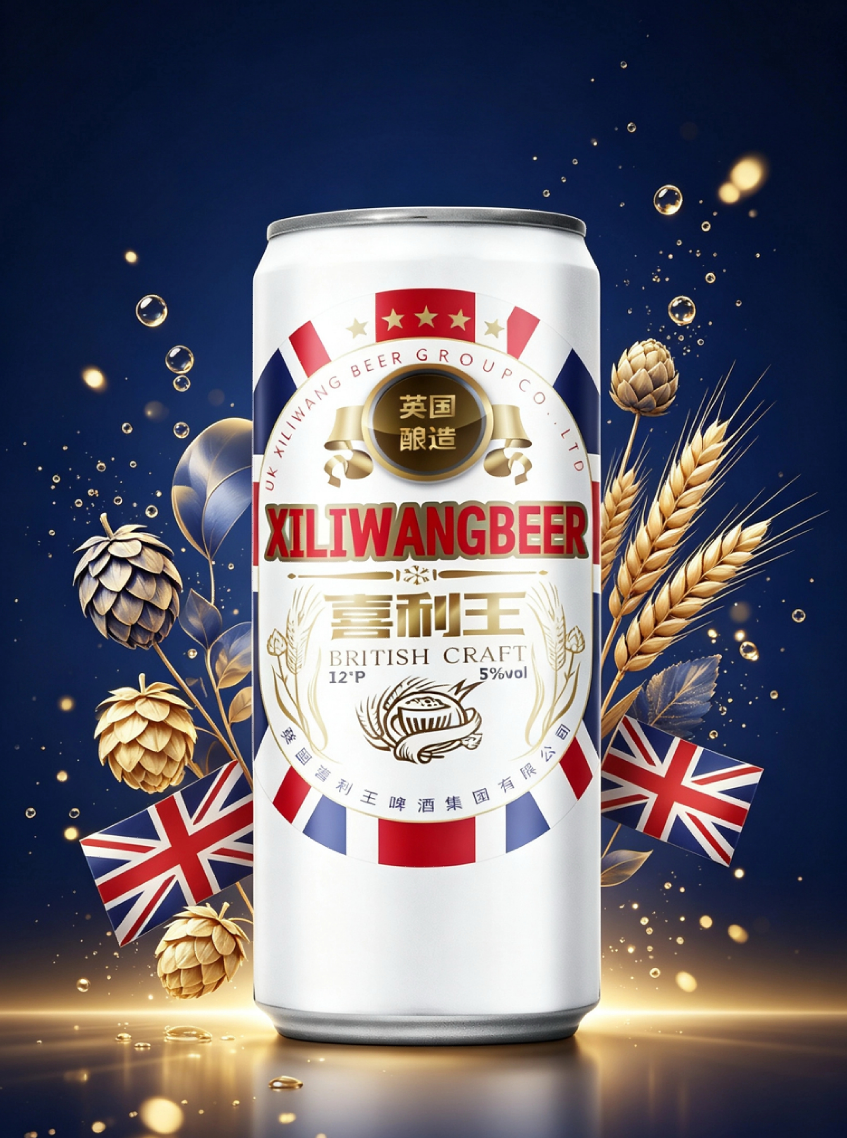
— Xiliwang - bottle on dark background
The same “British identity,” two completely different occasion languages, neither stealing the other’s spotlight, and each backing the other up. You try the can, like it, and next time you’re hosting a dinner you’ll want to try the bottle—the consumer’s upgrade path is paved by the packaging itself.
I’ve seen too many brands with one logo conquering the world, cans and bottles looking identical, and calling it “unified visual system.” The result: not eye-catching on the shelf, not fitting in the occasion, and the two product lines diluting each other. Xiliwang’s approach at least thinks clearly about “which drink is speaking for whom, and on what occasion.”
04
Let me be straight with you
Packaging, at the end of the day, is making an “identity judgment” on the consumer’s behalf: is this brand worth bringing out? Does it look like the real thing? Will it make me look like I have no taste?
If your product is already so good there’s nothing left to say, then packaging has just one job—make consumers believe it tastes good. The Union Jack, the wheat ears, the deep-blue-and-gold label—behind all these symbols, they’re helping you cash in “quality” as trust in advance.
Next time you design packaging, don’t just think about printing the full ingredient list. First ask yourself: the instant consumers see your product, what’s the word that pops into their head—“cheap” or “particular”? That word is the real KPI of packaging. (Content generated by AI, for reference only)
Sanyao Packaging
Good packaging speaks for itself
About This Case: Quick Answers
My product is good, but why should consumers believe that?
Trust is grown, not shouted. Break trust down into visible details: real ingredients, restrained claims, traceable symbols of origin. The less you boast about a feature, the more buyers reach the conclusion themselves that "this thing is reliable."
Can my baijiu product use the same approach as the "Xiliwang" playbook?
Yes. This logic doesn't discriminate by category—it works as long as your product looks like everyone else's on the shelf and consumers can't recognize you in three seconds. When it comes to execution, we'll set a new plan based on your category, channel, and price band rather than forcing someone else's face onto yours.
If we hire you for baijiu packaging, how do you usually charge, and how long does it take?
We charge per project, depending on category complexity, the number of series, and whether prototyping extensions are included. Typically 2–4 weeks: the first week sets direction and positioning, the second week delivers the proposal, and the third and fourth weeks deepen, prototype, and finalize. Rush jobs can be compressed, but we recommend leaving time for physical prototyping. Send us your materials for a free diagnosis before we quote.
We're in another city—can we collaborate online?
Yes. Many of our projects are remote collaborations: materials coordinated online, proposals reviewed in the cloud, prototypes shipped by courier—no geographic limits, and we work with clients nationwide.
CommentsBe kind, communicate rationally