
Case review: the packaging design for a men's knife baijiu created for a Shandong distillery — good packaging design is "brand marketing" on the shelf
Why is it hard to move baijiu off the shelf? Packaging isn't about putting the liquor into a bottle; it's about putting the brand into a scenario. Using men's knife baijiu as an example, we break down the packaging design methodology of "short-term shelf conversion + long-term brand equity."

01
Introduction: Baijiu’s awkwardness begins with the “silence” on the shelf
Over the past two years, the most frequently discussed word in the baijiu industry is not “price hikes,” nor “collecting,” but “slow sell-through.”
Products are distributed, display fees are paid, sales reps run themselves ragged—yet when consumers walk up to the shelf, their eyes sweep across row after row of bottles, and within three seconds they find no reason to stop. Then they turn toward the checkout counter. That sale is lost forever.
Channels complain, distributors are stuck with inventory, brands run campaigns, buy ads, and launch scan-code red packets—but the starting point of the problem is often overlooked: the first time a consumer “sees” a brand is on the shelf, and the first thing the shelf says is spoken by the packaging.
We often say “good brand marketing = short-term confirmed revenue + long-term audience assets.” Applied to baijiu, this formula has its most down-to-earth landing point: good packaging design = short-term shelf conversion + long-term brand assets.
Today, we take “Nanren Dao Jiu” (Men’s Knife Baijiu) as a case study to review a design that truly builds both “sell-through” and “brand” into the packaging at once.
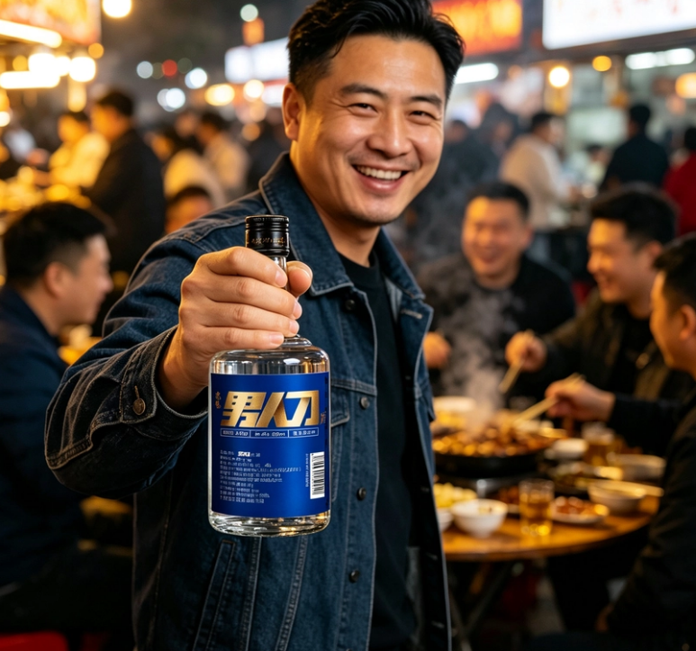
— Holding Nanren Dao Jiu at a night market food stall, a real drinking scene
02
Chapter 1 The sell-through dilemma: four layers of change the baijiu industry is going through
To understand why packaging matters, we first need to understand where exactly baijiu’s “slow sell-through” is difficult. It is not a channel problem, but a set of systemic changes.
First layer of change: consumer sovereignty awakens, hard advertising fails.
In the past, baijiu conquered the market through CCTV advertising—one line like “the wine of state banquets” could carry an entire brand. Today, consumers’ tolerance for hard advertising keeps declining; they trust real usage scenarios, recommendations from people around them, and that bottle on the dinner table they can “see and touch.” Marketing touchpoints are fragmented, grand narratives no longer work, and brands must return to “life scenarios” to be seen and trusted.
Second layer of change: baijiu’s consumption scenarios are being re-segmented.
Self-drinking, banquets, gifting, and collecting each correspond to completely different decision logic. Self-drinking looks at value for money and a sense of quality; banquets look at face and talking points; gifting looks at the packaging’s decency and symbolic meaning. If a bottle can only fit one scenario, its sell-through ceiling is locked; if it can’t even articulate a single scenario, it can only stay silent on the shelf.
Third layer of change: shelf competition enters the era of the “three-second rule.”
In supermarkets, tobacco-and-liquor stores, and restaurants, dozens or even hundreds of SKUs are crammed together. Consumers have no patience to listen to a salesperson; they are only struck by “first-glance information”—color, bottle shape, typography, texture. Any one element can become a reason to stop, or a reason to scroll past.
Fourth layer of change: homogeneous involution, price wars devour profit.
When every bottle is clear glass with red-and-gold color schemes, when every packaging piles on “dragon,” “phoenix,” “royal,” and “imperially bestowed,” the brand is left with only one weapon: price. When the price war reaches its end, distributors have no profit, brands have no budget, products have no image—and sell-through naturally gets harder and harder.
With these four layers of change stacked together, there is only one conclusion: baijiu’s competition is shifting from “the battle of channels” and “the battle of advertising” to “the battle for attention on the shelf” and “the battle for trust within scenarios.” And the main battlefield for both is packaging.
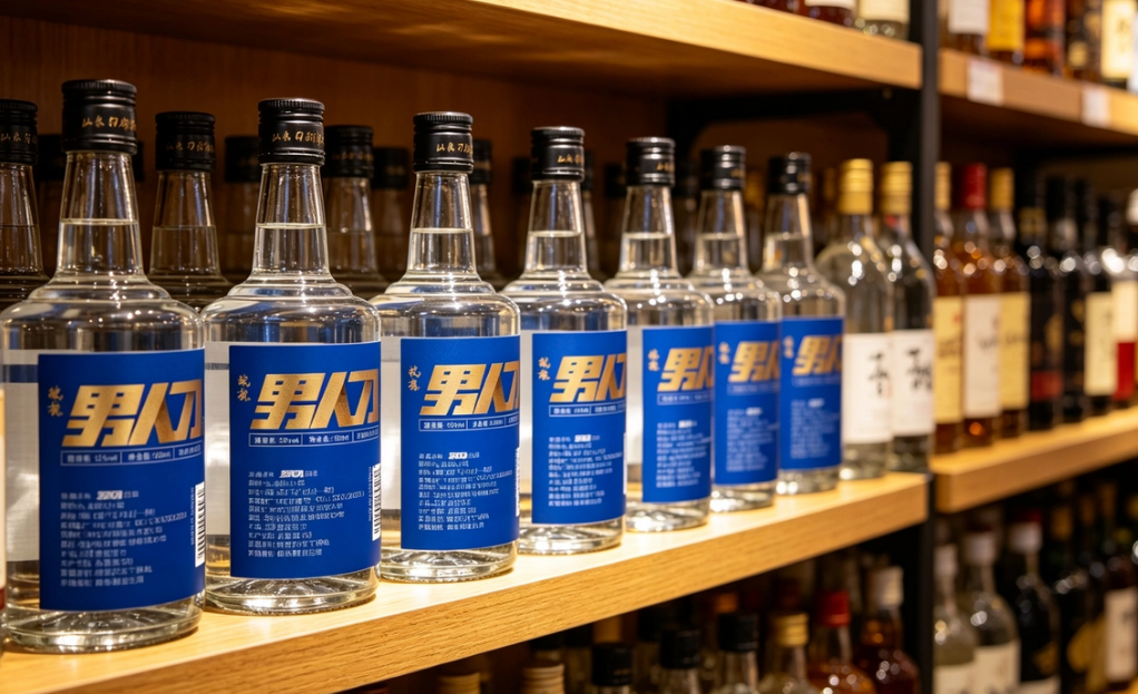
— Nanren Dao Jiu in shelf display, terminal visibility and recognizability
03
Chapter 2 Historical context: three evolutions of baijiu packaging from “container” to “asset”
To see packaging’s positioning clearly, we need a historical vertical axis. Chinese baijiu packaging has roughly gone through three stages:
The 1.0 era: the container era.
From clay jars and porcelain bottles to glass bottles, the core function of packaging was “holds it well, doesn’t leak, transports easily.” In this stage, packaging had nothing to do with brand; wine quality was the only voice. Consumers bought “the wine,” not “the bottle.”
The 2.0 era: the face era.
As business banquets and the gifting economy rose, packaging began to take on the function of “identity expression.” Gold-and-red color schemes, dragon and phoenix motifs, and heavy gift boxes became standard for high-end baijiu. In this stage, packaging did “value suggestion”—the more precious and elaborate, the more premium it looked. But the cost was severe homogenization: a hundred brands shared one visual grammar, and what consumers remembered was “the style,” not “the brand.”
The 3.0 era: the era of scenarios and assets.
As the incremental market became a stock market and young consumers became the main force, packaging began to answer three new questions: In what scenario is this bottle drunk? What emotion does it represent? Why should it be remembered? Packaging is no longer just a container, nor just face—it is the brand’s “content”: every shelf exposure is a touchpoint, every bottle opening is an experience, every share is a spread. Packaging thus becomes an accumulable brand asset.
Nanren Dao Jiu is precisely a product of this era. Its name comes with its own “scenario script”—knife means the jianghu, brotherhood, the thrill within the smoke and fire of everyday life; men is the audience portrait, the emotional resonance. What packaging needs to do is not explain “I am a high-end wine,” but deliver on “this bottle belongs to your life scenario.”
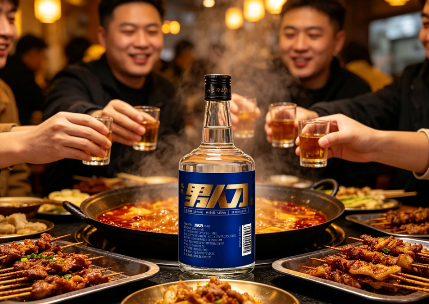
— Nanren Dao Jiu placed on the table in a warm-toned gathering scene, creating a real drinking atmosphere
04
Chapter 3 Design breakdown: how Nanren Dao Jiu’s “short-term shelf conversion” was forged
The first principle of sell-through is that consumers stop in front of the shelf. Nanren Dao Jiu’s packaging design completes conversion around four actions:
One: use color to create “shelf contrast.”
Amid rows upon rows of the red-gold-white main melody, the combination of deep blue and gold lettering naturally has a “stand-out” quality. The deep blue base is steady, calm, and modern, forming a strong contrast with the warm colors customary in the baijiu industry; the gold lettering retains baijiu’s “premium” DNA without losing a sense of status. The collision of cool and warm makes it, on the shelf, not “more like baijiu,” but “less like everyone else”—which is precisely the scarcest thing in the attention economy.
Two: use symbols to lower recognition cost.
“Nanren Dao” (Men’s Knife) is both a product name and a symbol. The hot-stamping craft makes the characters themselves the visual center, and the force between strokes echoes the imagery of “knife”—sharp, direct, no beating around the bush. Consumers don’t need to read the entire bottle’s description; they only need to remember three characters to “fish” it out from the shelf on their next repeat purchase. Low recognition cost is the prerequisite for high-frequency repeat purchase.
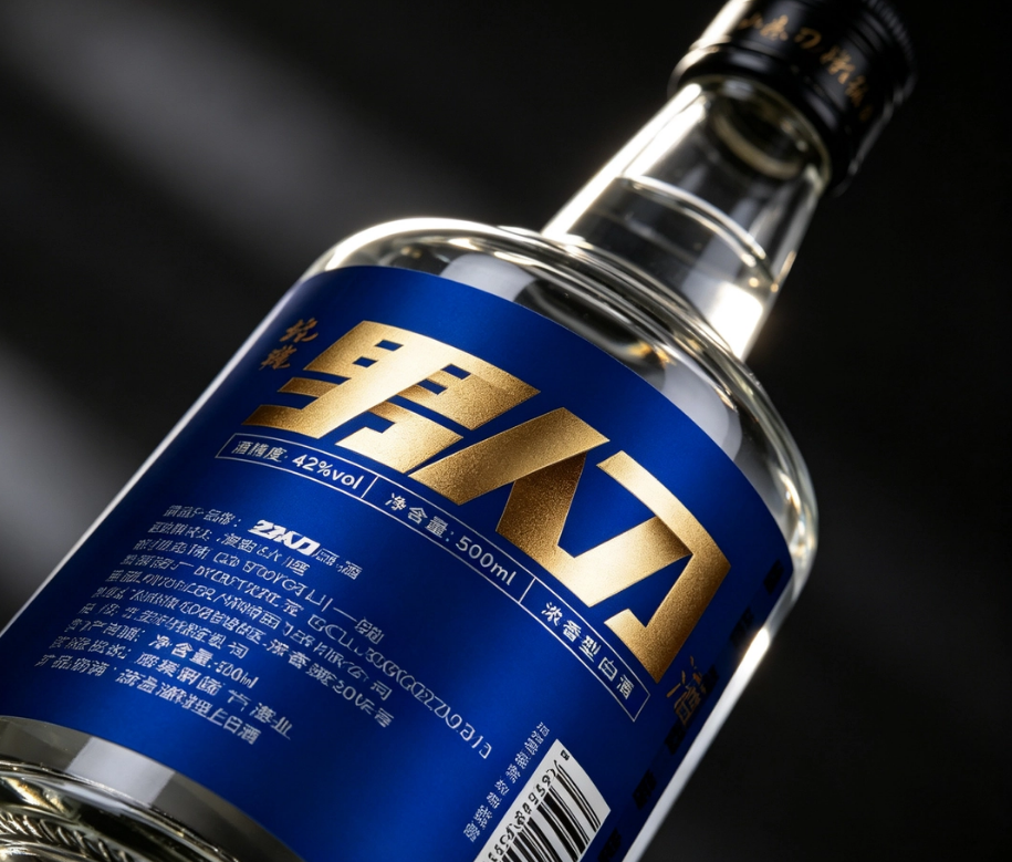
— Close-up of the hot-stamped lettering on the Nanren Dao Jiu bottle, brand symbol and information hierarchy
Three: use texture to convey “trustworthy quality.”
Trust in baijiu is half about drinking and half about looking. The glass bottle’s light transmission, the label’s paper and hot-stamping craft, and the damping feel of the cap together form consumers’ “pre-judgment” of wine quality. The mirror-like texture and detailed craftsmanship that Nanren Dao Jiu presents under dark-toned lighting convey a certainty that “this bottle is worth sitting down to savor.” Texture is not luxury, but respect for the consumer—it turns “first glance” into “first impression.”
Four: use scenario-based presentation to bridge the last meter “from seeing to buying.”
Once packaging design is complete, it still needs to be “put into life” for testing. The handheld close-up at the night market food stall, the real shots on the gathering table, the full-row effect of shelf display—these images are essentially answering the question in consumers’ subconscious: When will I drink this bottle? When packaging can be “caught” by real scenarios, sell-through turns from “an accident on the shelf” into “an inevitability within the scenario.”
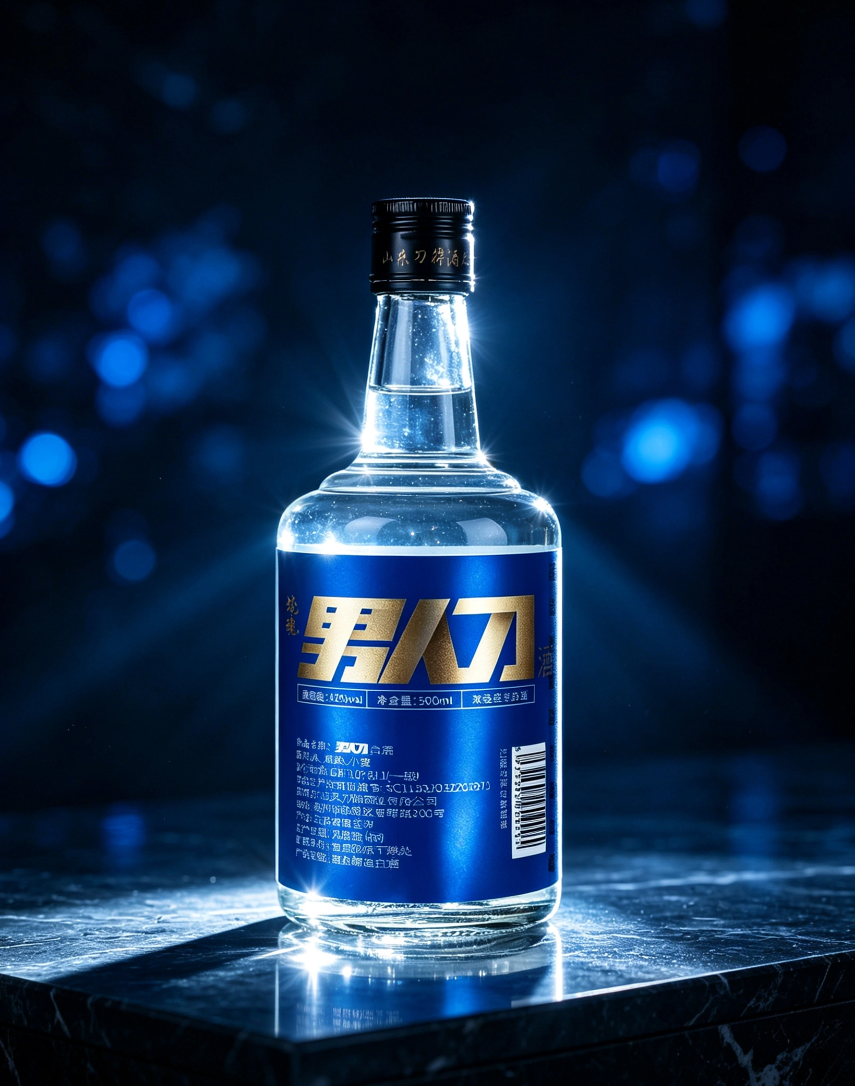
— Single bottle of Nanren Dao Jiu under a spotlight amid deep blue light spots, presenting a high-end texture
05
Chapter 4 From packaging to asset: how long-term brand compounding is accumulated
If “short-term shelf conversion” solves this one sale, then “long-term brand assets” solve the next sale, the next year, and the brand’s next ten years.
The reference article contains a key judgment: “Direct GMV validates the strategy’s effectiveness in the present, while long-term audience assets are the brand’s core capital.” Applied to packaging, the logic holds completely:
Packaging is the “content” of every touchpoint.
Every time a brand is seen, it is a content exposure. The shelf is the medium, packaging is the content, and the quality of the content determines whether the exposure is “forgotten in a glance” or “remembered for a lifetime.” Nanren Dao Jiu’s blue-and-gold visuals, hot-stamped symbols, and scenario imagery repeat the same memory point every time they appear—this repetition is not advertising bombardment, but subtle sedimentation in the mind.
Packaging is the “trigger” for repeat purchase and word of mouth.
Consumers take it home, open the bottle, drink, take photos, post to Moments, and buy again next time—throughout this entire chain, packaging is always present. A good-looking bottle will be left on the table as a talking point, will be captured in gathering photos, will become “that blue-bottle baijiu we drank last time.” When packaging becomes social currency, the brand gains a self-spreading channel that costs no advertising money.
Packaging is the “anchor” of audience assets.
The ultimate purpose of brand management is to make the target audience, when they think of you, evoke a certain beautiful feeling. For Nanren Dao Jiu’s target audience, that feeling is the smoke-and-fire warmth of “brothers gathered together, drinking heartily.” Packaging concretizes and symbolizes this feeling, so that every shelf encounter reinforces it. Over time, the brand gains a private-domain user pool that can be repeatedly reached, activated, and is highly trusted—this is precisely the core capital that lets a baijiu brand weather cycles.
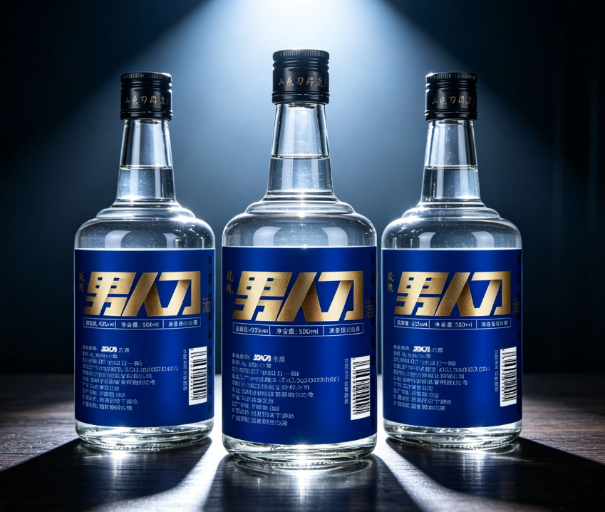
— Three bottles of Nanren Dao Jiu in a triangular display, presenting a sense of brand array under the spotlight
06
Chapter 5 Essential distillation: good packaging design is an investment in “certainty”
After going all the way around, back to the original question: what is good packaging design?
It’s not “the more expensive the better,” not “the flashier the better,” and not just “good-looking is enough.” Good packaging design must accomplish two things at once:
In the short term, it is the conversion engine on the shelf.
It must establish contrast within three seconds, clarify the category, convey texture, and hint at the scenario—turning “passing by” into “stopping,” and “taking a look” into “taking it away.” Packaging without short-term conversion ability, no matter how beautiful the design, is a silent cost.
In the long term, it is the compounding account of brand assets.
It must turn every touchpoint into memory, every bottle opening into experience, and every share into spread, so that the brand grows in consumers’ minds from “a bottle of wine” into “a symbol of a lifestyle.” Packaging without long-term sedimentation ability, no matter how explosive the sell-through, is only one-off traffic.
These two things are not an either-or choice; they must run on parallel tracks. Just as marketing pursues the unity of brand and performance, packaging’s “unity of brand and performance” is: use design to solve present conversion, use symbols to sediment long-term assets, and let every cent of packaging budget generate two kinds of returns at once.
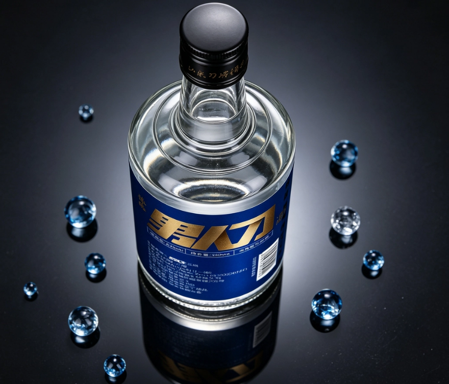
— Close-up of the blue label detail, presenting brand texture against a black mirror background
07
Conclusion: in an uncertain market, make the most certain investment
The baijiu industry is going through its most dramatic changes: channels are being restructured, audiences are being replaced, and the logic of traffic is failing. But one thing has never changed—consumers will always see the packaging first, then come to know the brand.
In an uncertain era, packaging is one of the few “certain” things: it certainly appears on every bottle, certainly goes through every shelf exposure, and certainly takes part in every bottle opening and share. Getting this right is making a certain long-term investment for the brand.
Nanren Dao Jiu’s answer is: return to real scenarios, use contrast to build attention, use symbols to lower recognition cost, use texture to build trust, and use sedimentation to accumulate compounding returns.
And this is exactly what we want to say to all brand owners: stop treating packaging as “putting the wine into a bottle,” and treat it as “putting the brand into the scenario.” Good packaging design is brand marketing on the shelf—it deserves to be taken seriously as a strategic investment.
This article is original content by Sanyao Packaging; the case images come from the Nanren Dao Jiu proposal materials.
Sanyao Packaging
Good packaging speaks
About This Case: Quick Answers
How exactly does a product get "seen" on the shelf?
Consumers give you only three seconds in front of the shelf. The most reliable approach is to design on two levels: at three meters, grab attention with color and shape; at one meter, stop people with information and cultural trust signals. The root cause of most products that don't sell isn't that they're bad — it's that the "good" never gets shouted out from three meters away.
The baijiu approach in this article — can my baijiu product use it too?
Yes. This logic doesn't discriminate by category — as long as your product stands on the shelf looking like everyone else's and consumers can't recognize you in three seconds, it works. When it comes to execution, we'll redefine the plan based on your category, channel, and price band rather than forcing someone else's face onto yours.
If we hire you for baijiu packaging, how do you usually charge, and how long does it take?
We charge per project, based on category complexity, the number of series, and whether prototyping and extensions are included. Typically 2–4 weeks: the first week sets direction and positioning, the second week delivers concepts, and the third and fourth weeks deepen, prototype, and finalize. Rush timelines can be compressed, but we recommend leaving time for physical prototyping. Send us your materials for a free diagnosis first, then we'll quote.
We're in another city — can we collaborate online?
Yes. Many of our projects are remote collaborations: materials coordinated online, concepts reviewed in the cloud, prototypes shipped by courier — no geographic limits, and we work with clients nationwide.
CommentsBe kind, communicate rationally