
Many bosses say food packaging should use red and yellow because that's how the market is—so what if we take a different approach to a roast chicken packaging design and turn it into the store's signature treasure?
First, a phenomenon. Take a stroll through the deli section of a supermarket and you'll notice a harsh truth: most braised deli food packaging looks very "temporary"—clear bags, plastic
Let me start with an observation. Take a walk through the deli section of any supermarket and you’ll notice a harsh truth: most braised deli packaging looks painfully “temporary”—a clear bag, a plastic container, a printed sticker slapped on—radiating a vibe of “buy it today, eat it today, don’t expect me to look impressive.” But one category does the opposite: products that are clearly local specialties, yet their packaging is pushed all the way to a “presentable as a gift” black-and-gold gift box.
The case I’m breaking down today is called “Tuozaozi Hand-Torn Chicken,” from a deli brand. After looking through its seven product photos, my biggest takeaway is this: it isn’t packaging a chicken—it’s building a persona for the “Tuozaozi” brand: a master of good cooking, with certifications, with traditional methods, with the air of a time-honored name that has years behind it.
01
Step one: black-and-gold color scheme to establish the “premium” feel first

— Tuozaozi Hand-Torn Chicken - black-and-gold hero image
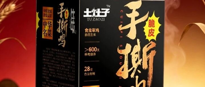
The first image: a deep black rectangular paper box, with the three large calligraphic characters “Hand-Torn Chicken” embossed in gold foil on the front, a yellow star mark beside them. Black background with gold foil—in the food world this combination is almost synonymous with “high-end.” Just looking at this box, your first reaction absolutely won’t be “a roast chicken,” but “some kind of refined gift.”
What’s even better is the detail: in the lower right corner, a small vertical seal reading “Famous Chinese Dish,” and along the side, “crispy skin,” “insect-fed chicken,” “≥600 days.” Notice this combination of information—it doesn’t say “our chicken is so, so delicious”; it says “I have credentials (Famous Chinese Dish), I have craft (traditional methods), I have patience (600 days).” With these three strokes, trust is maxed out instantly.
Honestly, when I first saw the words “Famous Chinese Dish,” I had a question mark in my head—these days anything can print a title on its packaging. But looking closer, it’s stamped with “Certified by the China Catering Association,” paired with “28 traditional secret recipes.” The endorsement chain is complete—it’s not empty sloganeering.
02
Step two: put the “ingredient evidence” right on the box
What I admire most about this case is that it dares to print a “close-up of chicken skin” on the packaging. Look at the second image: on the front of the black box, the bottom is a close-up of glistening chicken skin, its texture distinct, surrounded by chopped green and red chilies and deep green leaves.
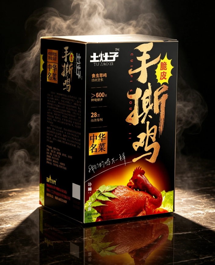
— Tuozaozi Hand-Torn Chicken - chicken skin ingredient close-up
This move is ruthless. The black-and-gold scheme handles the “premium feel,” the ingredient close-up handles the “appetite appeal”—one box, two jobs. Even through a screen, consumers can imagine that chicken skin crunching in their mouths—that’s “eating with your eyes first.”
Flip further and there’s a macro shot of green pepper strips and red pepper rings on a black background, and a scene shot of glistening chicken at the bottom surrounded by spice bits and clusters of green leaves. Every image does the same thing: it hammers you with visual proof that “this chicken is worth money.” It doesn’t say “we use insect-fed chicken”—it just shows you how glistening that chicken looks.
03
Step three: a set structure that gives “gifting” a sense of ceremony
I saw an image of a red outer box containing four small black boxes, with “Hand-Torn Chicken” in gold foil on the outer box, a “福” (fortune) character in the upper left, “insect-fed” and “≥600 days” printed on the sides of the black boxes, and red dates and pine branches against the red background.

— Tuozaozi Hand-Torn Chicken - red gift box set
This structure understands the Chinese psychology of gifting perfectly: the red outer box is “face,” the four black boxes are “substance,” the “福” character and pine branches are “good fortune.” One box, four pieces—opening it feels like unwrapping a present. The giver gains face, the receiver gets a surprise. Most importantly—it gives a single chicken the identity of a “gift box,” and the price anchor shoots right up.
Many deli owners haven’t figured this out: no matter how good your chicken tastes, sold loose it can only fetch a loose-sale price; but once it’s put into a black-and-gold gift box, paired with certifications and traditional-method endorsements, it goes from “market stall product” to “gift.” The price doubles, and consumers still feel it’s worth it.
04
A word of honesty
Tuozaozi’s packaging is essentially answering one question: how does a local roast chicken get sold at a “gift” price point?
The answer is these three strokes: identity endorsement (certification + traditional methods + years), visual evidence (ingredient close-ups), gift box structure (red set). Each stroke raises this chicken’s “standing,” rather than introducing how “delicious” it is—because deliciousness is something consumers have to confirm with their own bite, but the value of packaging is already delivered before that first bite.
Friends in the food business, especially those working with local specialties, should take a good look at this case. Your product isn’t lacking—what’s lacking is others’ first impression of whether it’s “worth that price.” (Content reflects personal views only, for reference.)
Sanyao Packaging
Good packaging speaks.
About This Case: Quick Answers
This article talks about a food approach—can it work for my food product too?
Yes. This logic isn't picky about category—as long as your product sits on the shelf looking like everyone else's and consumers can't recognize you in three seconds, it works. When it comes to actual execution, we'll redefine the plan based on your category, channel, and price band—we won't force someone else's face onto yours.
If I hire you for food packaging, how do you usually charge, and how long does it take?
We charge per project, depending on category complexity, the number of series, and whether prototyping and extensions are included. Typically 2–4 weeks: the first week sets direction and positioning, the second week delivers the proposal, and the third and fourth weeks deepen, prototype, and finalize. Rush jobs can be compressed, but we recommend leaving time for physical prototyping. Send us your materials for a free diagnosis first, then we'll quote.
We're in another city—can we collaborate online?
Yes. Many of our projects are remote collaborations: materials coordinated online, proposals reviewed in the cloud, and prototypes shipped by courier—no geographic limits, and we work with clients nationwide.
Is packaging a cost or an asset?
It's pricing power. If you treat it as a cost to cut, it gets clawed back from your selling price; if you treat it as an investment, it tells your worth before consumers even reach for their wallets. Good packaging does just one thing: it makes the product look—and genuinely be—worth that price.
CommentsBe kind, communicate rationally