
Thoughts on packaging design for regular local beer: the first few seconds of seeing the packaging are the very front line of marketing performance!
A friend asked me what the biggest change in marketing in 2026 is. I've been reading a report on global marketing shifts, and there's a detail in it I've remembered for a long time:
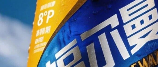
A friend asked me what the biggest change in marketing is right now.
I’ve been reading a report on global marketing shifts, and one detail stuck with me: Walmart is slashing prices while its e-commerce grows 24%. Consumers aren’t out of money — they’re just spending it more selectively. They’ll compare prices on paper towels over and over, but won’t blink at splurging on a trip.
That “is it worth it” calculation, once it lands on the shelf, comes down to how much effort your bottle saves the consumer.
Last year we did a packaging version for a beer — blue and yellow in clashing contrast, really “loud.” When the proposal came out, there was actually a round of internal argument — some people thought it was too gaudy, not “premium” enough. So we ran an experiment: we placed several beer bottles side by side in a shelf photo and asked whether, glancing from a meter away, you could spot it at first sight. The blue-and-yellow one won by a clear margin.
I thought at the time, what does that “win” mean? It’s not that it’s more beautiful — it’s that it made the decision for the consumer. A person stands in front of the shelf for three seconds, hundreds of bottles, and whoever gets seen first loses one fewer chance of being passed over.
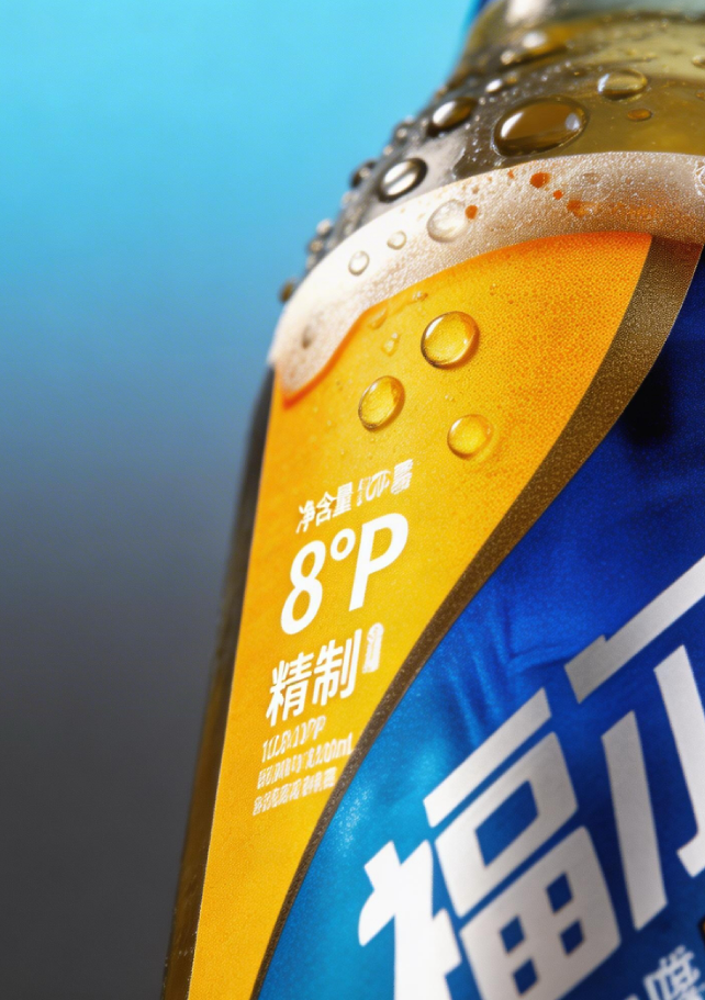
— Foreman White Beer single-bottle still-life display
We made this packaging version very “clean”: a glass bottle, a blue aluminum cap, a label with a blue-to-yellow gradient, and a line of frosted-silver foil-stamped lettering pressed right in the center. We tuned that gradient detail for a long time — the blue-to-yellow transition can’t be muddy, can’t be dirty; when printed it has to look as clean as a sunset sinking into the sea. On the fourth prototyping round, the client held the bottle up to the light and said the gradient had finally “smoothed out.”
The label also gives all the information it should: wort strength, net volume, a snowflake icon — not one missing. On the shelf, people are first caught by the color, and on the second glance they can take in these hard facts, completing the whole “recognize it—trust it” process within two seconds.
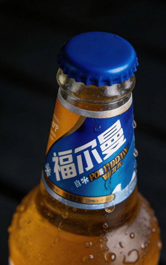
— Close-up of the blue-to-yellow gradient label and frosted-silver foil stamping
That line in the report is quite right: consumers haven’t stopped spending; they’ve become more selective. Being selective means you have to give them a reason to choose you. That reason isn’t necessarily hidden in the price — sometimes it’s hidden in shelf visibility.
The copy we later paired with this packaging version was also simple, just one line: Good taste, fair price, seen at a glance. Nothing else.
You might say it’s a bit tacky? A little. But packaging that can make someone stop in three seconds has already completed the very first step of marketing. All the taste, sentiment, and brand story come afterward — things people only have time to hear once they’ve stopped.
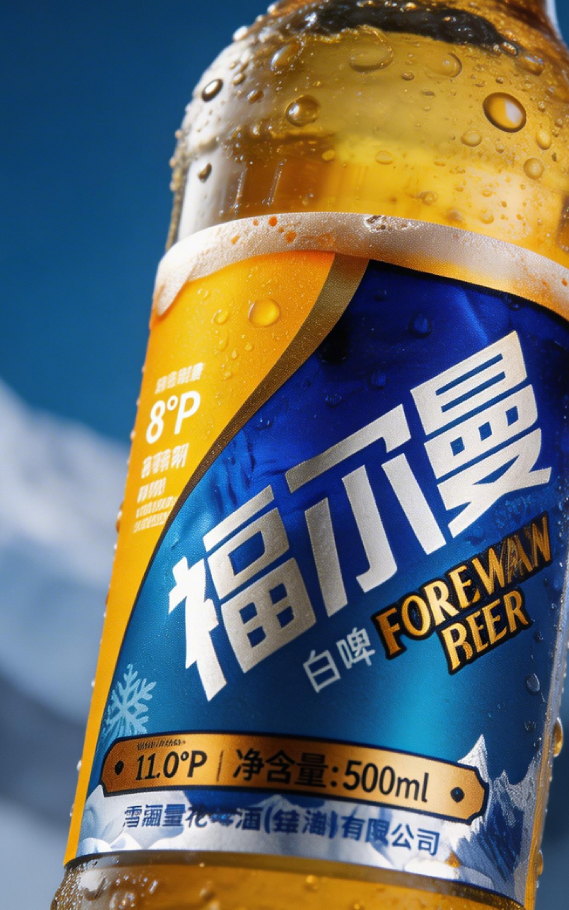
— Detail of condensation droplets and the snowflake icon
There was, there was an older gentleman who pointed at the bottle and asked: What brand is this? Blue and yellow, pretty eye-catching. He said in that moment he understood — color isn’t decoration, it’s a hook.
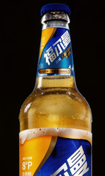
— Blue aluminum-cap bottle against a night-scene background
I increasingly feel that the very first step of marketing is never in the ads — it’s on the shelf, on the screen, in those three seconds. Whether your product can be seen, remembered, and picked up all depends on those three seconds.
Sanyao Packaging
Good packaging speaks
About This Case: Quick Answers
How exactly does a product get "seen" on the shelf?
Consumers give you only three seconds in front of the shelf. The most reliable approach is to design on two levels: at three meters, grab attention with color and shape; at one meter, stop people with information and cultural trust signals. The root cause of most products that don't sell isn't that they're bad—it's that the "good" never gets shouted out from three meters away.
The baijiu approach in this article—can it work for my baijiu product too?
Yes. This logic doesn't discriminate by category—as long as your product stands on the shelf looking like everyone else's and consumers can't recognize you in three seconds, it applies. When it comes to execution, we'll redefine the plan around your category, channel, and price tier rather than forcing someone else's face onto yours.
If I hire you for baijiu packaging, how do you usually charge, and how long does it take?
We charge per project, based on category complexity, the number of series, and whether prototyping and extensions are included. Typically 2–4 weeks: week one sets direction and positioning, week two delivers concepts, and weeks three and four deepen, prototype, and finalize. Rush timelines can be compressed, but we recommend leaving time for physical prototyping. Send us your materials for a free diagnosis first, then we'll quote.
We're in another city—can we collaborate online?
Yes. Many of our projects are remote collaborations: materials coordinated online, concepts reviewed in the cloud, prototypes shipped by courier—no geographic limits, and we work with clients nationwide.
CommentsBe kind, communicate rationally