
The biggest pitfall in packaging design: chasing beauty alone without finding your own distinctive character means dropping the watermelon to pick up a sesame seed~
Case study of Beili Ganlu Licorice Aged Wine: how packaging design can avoid the disconnect between the pitch and the market, from the unboxing ritual to shelf execution.

Let me start with a script almost every brand owner has been through.
The boss decides the product needs an upgrade and hires a design firm. At the pitch meeting, renderings cover the entire wall, the concepts are wildly elaborate, and the creative director gets so worked up he pounds the table. The boss nods and pays. Three months later, the prototype comes out—the color is off, the material feels cheap, the bottle shape doesn’t work with the production line, and after endless revisions it’s rushed to market. On the shelf, it blends in with the competing products next to it, and nobody gives it a second glance. The file gets locked in a drawer, and everything goes back to normal.
The packaging design industry doesn’t lack beautiful proposals; what it lacks is packaging that can actually be executed.
Over the past few years, I’ve worked with quite a few packaging design teams and examined their finished products bottle by bottle. Slowly, I’ve come to understand one thing: the value of packaging design has never been about “delivering renderings”—it’s about “delivering business results after the product hits the shelf.” This realization truly hit me when I saw a set of baijiu packaging cases from the team at “Beili Ganlu.”
01
Redefining packaging design: it’s not about delivering drawings, it’s about delivering results
There have long been two approaches in the industry. One is the “drawing school”: precise positioning, stunning visuals, the proposal is everything. If prototyping fails, it’s not their problem—it’s the factory’s fault or the budget’s fault. The other is the “execution school”: they believe packaging is just following a process—prototyping, color matching, die-line adjustments—anyone can do it, no creativity needed.
Neither approach produces good packaging. The real issue is that packaging design has never been a choice between “looks good” and “can be made.” It’s the coordination of an entire chain—from strategy to visual system to materials to prototyping to shelf presence to unboxing. If any link breaks, all the money spent earlier is wasted.
I call this logic “Packaging = Strategy × Visuals × Execution.” Note that it’s multiplication, not addition—if any factor is zero, the whole thing is zero. No matter how brilliant the concept, if prototyping fails, it’s zero. No matter how exquisite the craftsmanship, if it doesn’t stand out on the shelf, it’s zero.
02
To judge whether a packaging team is reliable, look at four things first
Before deciding whose hands to put the bottle in, brand owners might want to screen with four dimensions—it can save 90% of the back-and-forth later.
First, does it have a systematic methodology, not just a material library? A proposal cobbled together from a few “hit cases” will fail the moment you switch to a different category. A reliable team must have its own analytical framework—from category shelf to consumption scenarios to craft boundaries. They can explain the why behind every step and where the boundaries lie.
Second, can the proposal be turned into verifiable shelf results? At the pitch, they say “this design will make the shelf more eye-catching.” How do you judge that when the prototype comes out? Set acceptance criteria: how much color deviation is acceptable, what level of frosted feel must be achieved, how much weight the box must bear. A team willing to put these into the contract is worth talking to.
Third, have they done the “dumb work” of going to factories and squatting on shelves? Proposals written only from desk research reveal their true colors the moment prototyping starts. A reliable team will go to the printing factory to watch color, to the glass factory to feel bottle shapes, and to retail stores to see how competitors are displayed—designing within real craftsmanship and real shelves.
Fourth, look at the categories they’ve served and their reputation. A team used to mass-market beverages may not understand the logic of gift-box baijiu. A team that has achieved repeat purchase and referrals in a specific category will almost certainly have solid execution capability.
03
Deep dive: how a packaging set goes from strategy to unboxing
Take the licorice aged liquor made by the “Beili Ganlu” team. This is a baijiu from Qinghai, 38 degrees, 500 ml, transparent glass bottle, brown cork with a metal holder, and a milky white, irregularly shaped label on the bottle printed with a blue mountain silhouette and a line of Tibetan-style blessing, “Tashi Delek.”
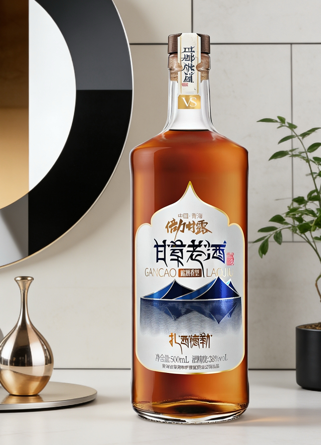
— Licorice aged liquor - home tabletop
At first glance, this bottle even looks a bit “plain.” Cork + metal holder is the foreign liquor playbook; milky white label + handwritten typography is the folk-art tone; mountain silhouette + Tashi Delek is the regional symbol. Three languages stacked together actually do the same thing—translating a local product into a gift “worthy of being taken seriously.”
Diagnosis first. Before designing this packaging, the team didn’t rush to draw. They first asked the product clearly: Who is it sold to? Is it a Qinghai specialty taken home as a gift, or drunk at the dinner table? Where are the channels? Specialty stores, supermarkets, or gift boxes for gifting? Every image was created only after answering these questions.
Materials speak for the design. The cork with metal holder isn’t for looks; it’s to give “the moment you twist open the cap” a sense of ritual—the cork’s “pop” is more premium than a screw cap. The milky white label on clear glass lets light through; the label’s outline is soft and irregular, and you can feel the paper’s texture. These details are invisible unless you look closely, but in hand, they simply feel better than a glossy label.
Unboxing is the final step. What moved me most about this packaging set is the gift box. A deep blue velvet rigid gift box; open the lid and three bottles lie side by side, accompanied by a gold ribbon and champagne-colored dried flowers. From a top-down view, it’s like opening a jewelry box.
— Licorice aged liquor - velvet gift box unboxing
What does the giver want? Not the liquor itself, but “the look on the recipient’s face the moment the box opens.” Deep blue velvet, gold ribbon, dried flowers—these three things alone create the word “solemn.” Before the recipient even tastes the liquor, they’ve already been won over by the gift box’s sense of ritual—that’s the power of unboxing, and the beginning of rebuilding trust.
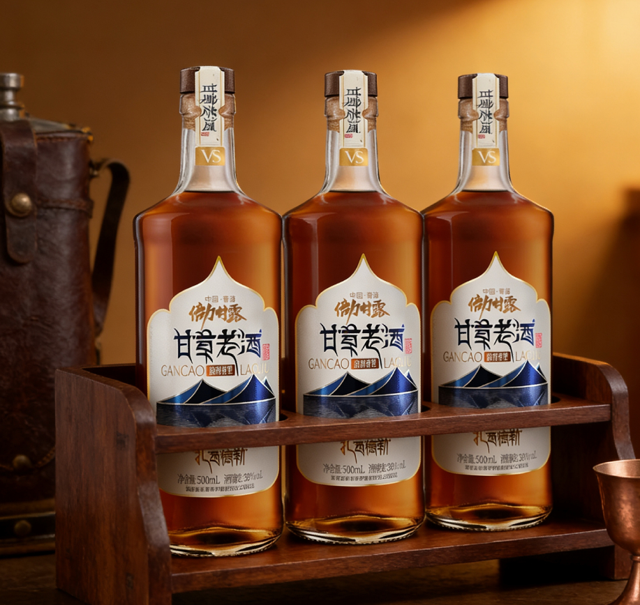
Scenarios stand in for the brand. There’s another set of shots that left a deep impression: the bottle leaning on rough rocks, withered yellow reeds nearby, sunlight casting from the side, warm and cozy. Another: the bottle on a wooden shelf, next to a vintage leather canteen and a copper cup, under warm lighting, like a night’s rest on a journey.

— Licorice aged liquor - outdoor rocks and reeds
A niche liquor from Qinghai could only lie in the corner of a specialty store, but through these scenes—modern home tabletop, outdoor wilderness, campfire on a journey—it’s placed in the context of “lifestyle.” The endpoint of packaging isn’t the bottle itself; it’s the image in which the bottle appears.
04
Execution guide: five hard truths to help brand owners avoid pitfalls
After seeing the whole process, I’ve tried to summarize the pitfalls of choosing a design team into five points, all experienced by brand owners around me:
First, don’t treat packaging design as “drawing.” Design is just the tip of the iceberg. Real packaging engineering must penetrate product positioning, materials and craftsmanship, cost control, channel display, and unboxing experience. A team that can only draw—no matter how low the quote, don’t touch them.
Second, don’t just look at renderings; look at prototypes. Renderings are the ideal; prototypes are reality. Before discussing cooperation, ask for a prototype first—see if the color, feel, and structure actually work. That one prototype can screen out half the teams.
Third, don’t expect a design firm to “cure all diseases.” Packaging can’t save a product without product strength. A reliable team will first tell you where the boundaries are—“Your liquor needs to solve the channel problem first; packaging can only add icing on the cake.” Those who dare to say this are more genuine than those full of “industry disruption.”
Fourth, the boss must make the final call personally. Packaging is the boss’s business decision, not an aesthetic exercise for the design or marketing department. At key nodes—key visual, bottle shape, materials, cost—if the boss doesn’t decide, ten rounds of revisions later will still be wasted.
Fifth, don’t chase a one-time hit; build a system. A successful launch doesn’t equal long-term growth. Key visual, bottle shape, gift box, display materials, scene photography—they must be an interlocking system that can be reused for the next new product. That’s the key to turning packaging investment into an asset.
05
A closing word
The packaging design industry has been a mixed bag these past few years, with all kinds of “super symbols” and “hit methodologies” flying around. But if you bring the conversation back to business, it’s really just one sentence: this thing hits the shelf, sits there, gets picked up, the box is opened, it’s drunk—whether every step goes smoothly is the real test of packaging.
Next time you talk to a design firm about packaging, don’t rush to look at renderings. Ask first:
“Can you stay with me and get this bottle’s prototype made?”
If they answer without hesitation, then talk further.
Sanyao Packaging
Good packaging speaks.
About This Case: Quick Answers
Are finishing processes on packaging (foil stamping, matte lamination, etc.) worth it?
A few cents to a dollar more per bottle buys you a texture that lights up instantly under the counter lights, and the gut feeling that "this bottle isn't cheap." Finishing isn't showing off technique—it's money spent to make consumers willing to believe it's worth the price, and that dollar comes back doubled in the selling price.
Can my gift box products use this "packaging" approach too?
Yes. This logic doesn't discriminate by category—as long as your product looks about the same as everyone else's on the shelf and consumers can't recognize you in three seconds, it works. When it comes to execution, we'll set a new plan based on your category, channel, and price band, rather than forcing someone else's face onto yours.
If I hire you for gift box packaging, how do you usually charge, and how long does it take?
We charge per project, depending on category complexity, number of series, and whether prototyping and extensions are included. Typically 2–4 weeks: week one sets direction and positioning, week two delivers concepts, weeks three and four deepen into prototyping and final files. Rush timelines can be compressed, but we recommend leaving time for physical prototyping. Send us your materials for a free diagnosis before we quote.
We're in another city—can we collaborate online?
Yes. Many of our projects are remote collaborations: materials coordinated online, concepts reviewed in the cloud, prototypes shipped by courier—no geographic limits, and we work with clients nationwide.
CommentsBe kind, communicate rationally