
From This Hunan Baijiu Packaging Design, We Discovered a Painful Truth: When the Marketing Hype Fades, Packaging Is a Brand's Most Honest Advertisement
Collaborations falling flat, eroding trust, homogenized creativity—the hype of marketing is fading. Using Dongjing Yuanjiang Liquor as an example, we break down "credible product quality + perceptible brand personality" to see how packaging becomes a brand's most honest advertisement.
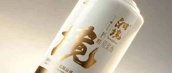
01
Introduction: The “false fire” of marketing can’t burn trust into a brand
In the first half of 2026, the marketing industry looked like a house divided between ice and fire: on one side, new concepts like AI and GEO kept heating up; on the other, budget cuts, homogenized creativity, failing co-branding, and eroding trust all erupted at once.
One set of data should put every brand on alert: nearly 80% of consumers have seen their overall trust in brands decline, and most people now agree that “high quality doesn’t have to mean high price” and “a big name isn’t a guarantee of quality.” More than brand marketing talk, consumers trust the actual texture and experience of a product. Meanwhile, in the first half of the year, 17 mainstream tea beverage brands ran a combined 86 IP collaborations—about 1.5 per day—and beauty brands under international giants ran 50 collaborations in total. Yet these high-frequency moves almost all sank without a trace.
Failing co-branding, traffic disasters, and concept hype that consumers resent all come down to one thing: when everyone is shouting in the same way, consumers choose to cover their ears. The false fire of marketing can’t burn trust into a brand.
And that trust gap is exactly what gives the most “clumsy” medium a chance to take the stage again—packaging. It doesn’t make grand claims, doesn’t chase trends, doesn’t play with concepts. It just stands there honestly, letting consumers see it, touch it, weigh it. Today, using Dongjing Yuanjiang Jiu as our example, we break down why, in an era of eroding trust, good packaging design = credible product texture + perceivable brand personality, and why packaging is a brand’s most honest advertisement.
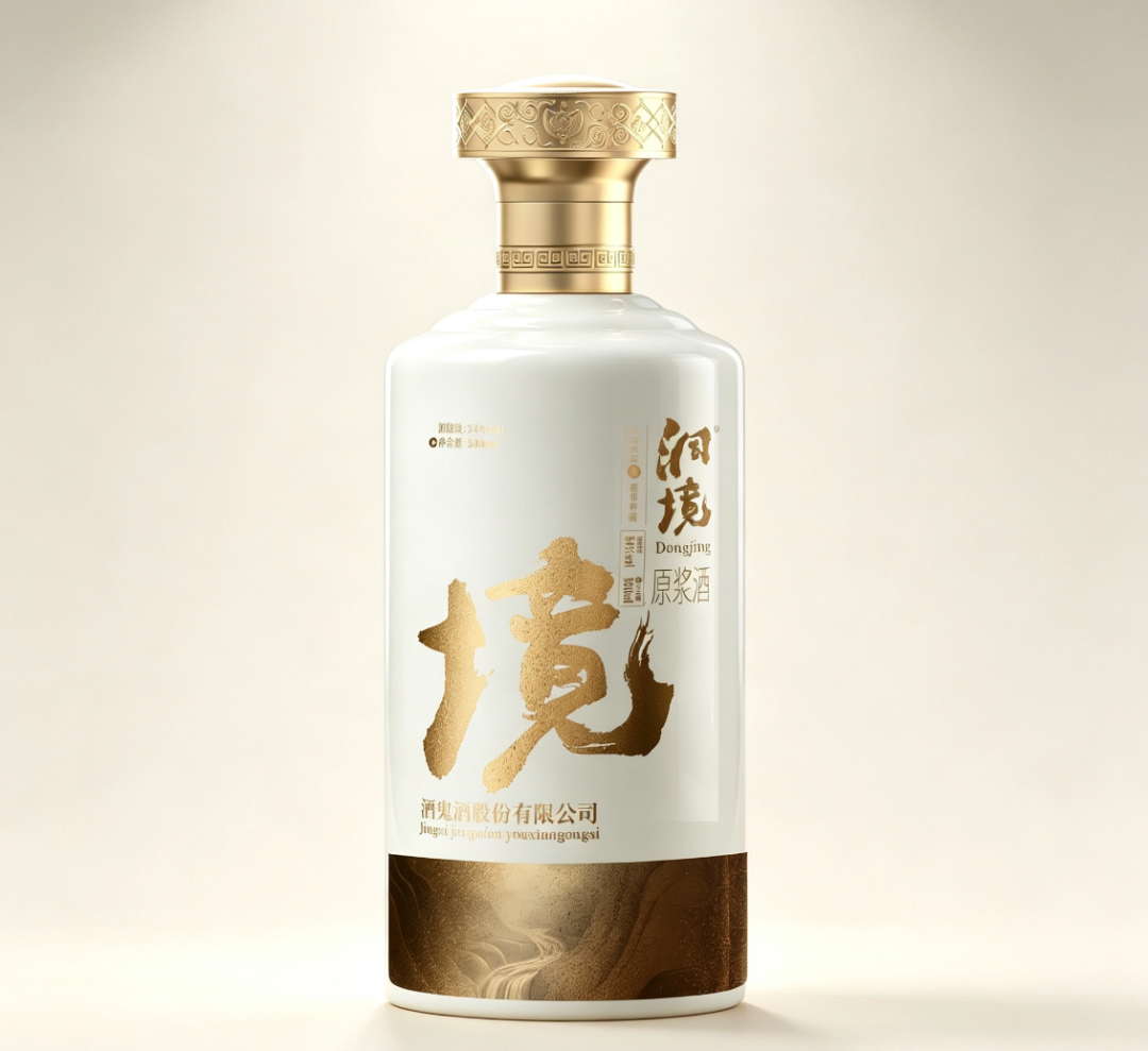
— Dongjing Yuanjiang Jiu front visual on a pure white background, the full presentation of the white porcelain bottle and gold cap
02
Chapter 1 Industry pain points: homogenized marketing is failing across the board
First, let’s look at what’s happening in the industry.
First, high-frequency co-branding brings aesthetic fatigue. When co-branding goes from a scarce resource to everyday routine, consumers’ excitement threshold for the word “collaboration” is rapidly raised—and then rapidly shattered. The same crossovers, the same limited editions, the same marketing press releases yield ever-lower discussion and conversion rates. It’s not that co-branding is bad; it’s that co-branding is no longer scarce.
Second, the chase for traffic backfires on brand credibility. Brands set no boundaries in pursuit of traffic, and one disaster follows another. Consumers’ attitude is direct: 49.75% of respondents believe companies should cut back on “emotional manipulation” and “concept hype.” The harder they perform, the more trust they burn.
Third, AI mass production worsens content homogenization. Take this very document—it was completed with AI assistance. The spread of AIGC tools has sent the cost of content production plummeting, and made “a flood of low-quality content” the norm. Likes without conversion have become standard, and consumer trust in new-media content keeps falling. When the cost of producing a piece of marketing content approaches zero, its persuasiveness approaches zero too.
All three threads point to the same conclusion: in an environment flooded with homogenized supply, anything “said” is hard to believe anymore; only what can be seen, touched, and felt has a chance to rebuild trust.
This is exactly packaging’s opportunity. It isn’t an appendage of marketing—it’s the most direct, most impossible-to-fake physical point of contact between a brand and its consumers.
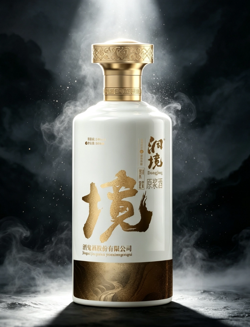
— Dongjing Yuanjiang Jiu set in a smoke-wreathed, low-key scene, a mysterious and solemn Eastern mood
03
Chapter 2 Consumer psychology: from “trusting ads” to “trusting texture”
Why is packaging so important right now? Because consumers’ decision logic has changed.
In the past, the path to building brand awareness was “advertising → memory → purchase”: brands ran enough ads, consumers remembered enough information, and purchases happened naturally. This was a path that relied on “being told,” and advertising’s persuasiveness rested on information asymmetry.
Today, that path is collapsing. Consumer sovereignty has fully awakened; they’ve seen too much exaggerated promotion and stepped in too many “image doesn’t match reality” traps. The new decision logic has become “perception → judgment → trust → purchase”: consumers must first perceive a product’s texture through real contact, then judge whether the brand is trustworthy, and only once trust is built does a purchase happen.
This is exactly the underlying logic of “if a brand wants to win hearts, it must first learn to be human.” Consumers can tolerate imperfection, but not falseness. They want a brand to be like a real person: with attitude, with substance, with detail—even flaws allowed. And packaging is precisely the most honest face a brand shows when it “learns to be human”—it can’t be glossed over with copy; every bit of texture has to be delivered through real craftsmanship.
Online content can be retouched, polished, and trend-chased, but the weight of a bottle in your hand, the resistance of a cap as you twist it open, the sheen reflecting off porcelain, the feel of gold foil on a label—these are immediate, real, impossible-to-fake experiences. Consumers’ agreement that “high quality doesn’t have to mean high price” is essentially saying: I don’t care what you say; I care what I touch.
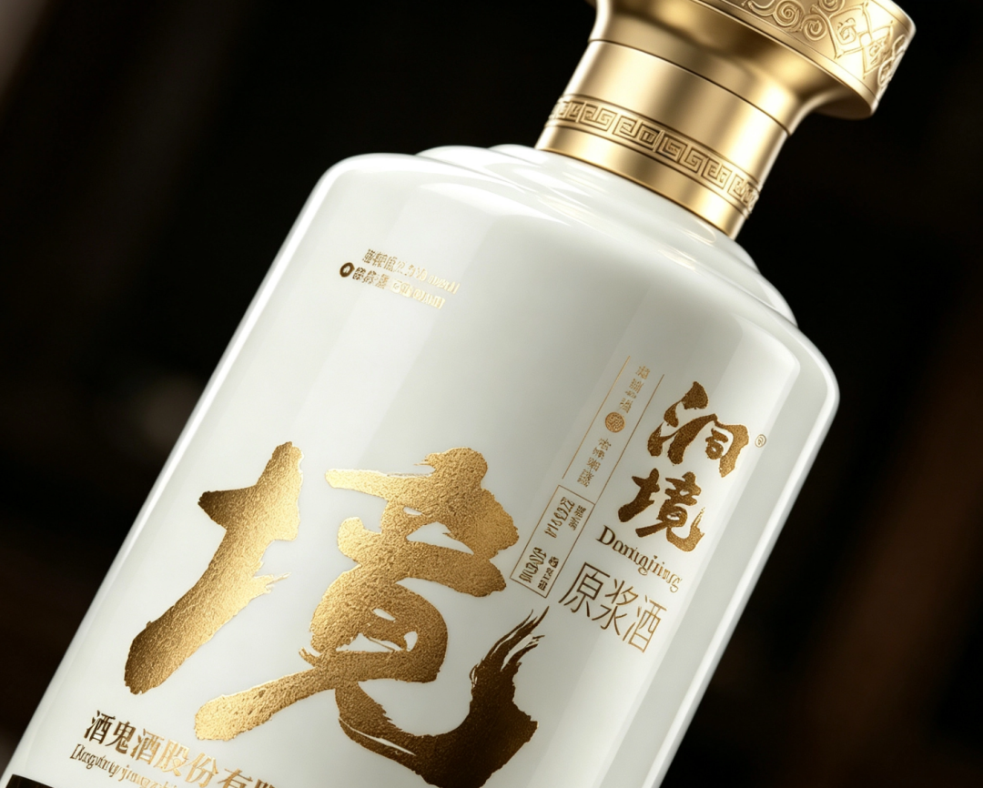
— Close-up of the shoulder of the Dongjing Yuanjiang Jiu bottle, the brushstroke of the gold “境” character with its sandy-gold texture, and the fret-pattern relief on the cap
04
Chapter 3 Historical evolution: baijiu packaging from “status symbol” to “trust carrier”
To understand why packaging can carry trust, we need to look back at the evolution of baijiu packaging.
The 1.0 era: packaging as “container.” Clay jars, porcelain bottles, glass bottles—the core function was storage and transport. Packaging had nothing to do with the brand; consumers bought the liquor, not the bottle.
The 2.0 era: packaging as “status symbol.” After business banquets and the gifting economy rose, packaging began to carry value cues: dragon and phoenix motifs, gold-and-red color schemes, heavy gift boxes—the more elaborate, the more distinguished it seemed. But this era planted a hidden danger: when every brand shares one visual grammar, packaging no longer expresses “who I am” but “who I look like.” The fate of homogenization was sealed from that moment.
The 3.0 era: packaging as “trust carrier.” When marketing talk fails across the board, consumers start voting with their fingertips: they touch materials, weigh heft, scrutinize craftsmanship, and judge through real sensory experience whether a brand is worth entrusting. Packaging’s function returns from “persuading” to “proving”—proving product quality, proving brand attitude, proving this transaction is worthy of trust.
The packaging of Dongjing Yuanjiang Jiu is a textbook sample of the 3.0 era. Every craft detail answers the same question: how do you make consumers certain, before they even open the packaging, that this bottle is worth it?
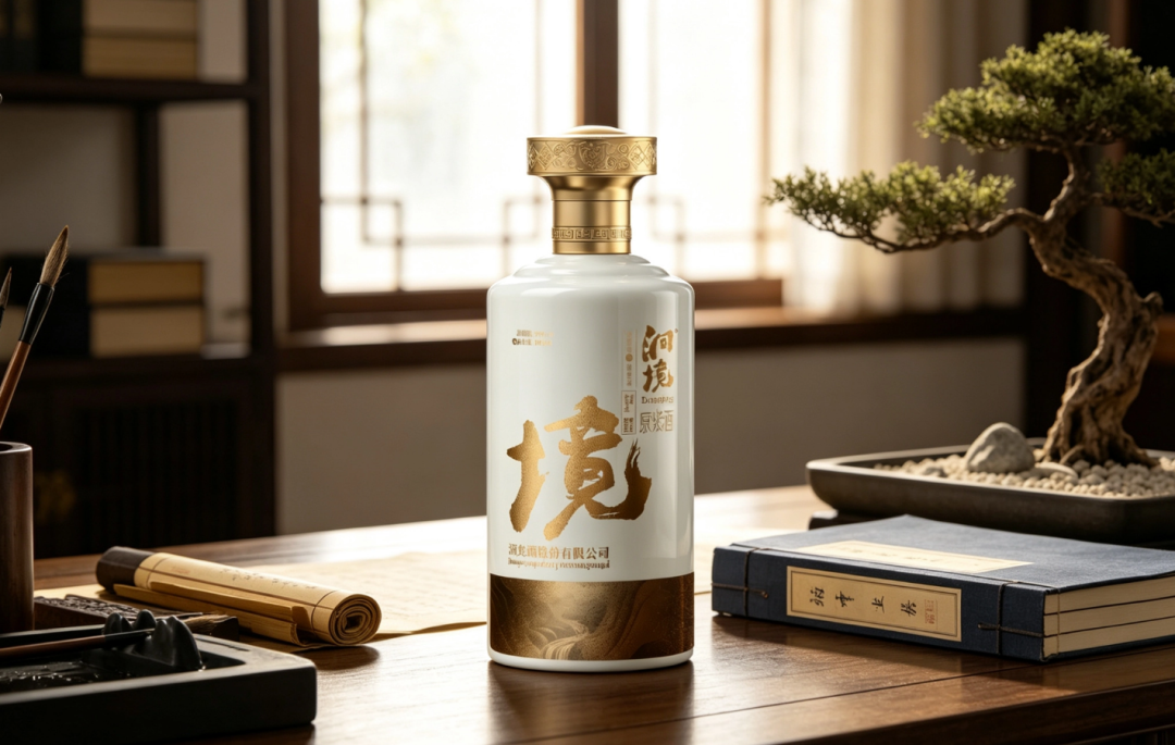
— Dongjing Yuanjiang Jiu in a Chinese-style desk scene, with a brush and scroll, a bonsai, and thread-bound books forming a literati living context
05
Chapter 4 Design breakdown: how Dongjing’s “credible texture” is built layer by layer
Dongjing’s packaging design is a systematic project built around “real texture.” We start from the craft details and break it down layer by layer.
One: white porcelain glaze—turning the trustworthiness of “porcelain” into the bottle’s language.
The bottle uses a white porcelain glaze—smooth, warm, and brightly reflective. In the Chinese mind, porcelain naturally carries the subconscious of “exquisite craftsmanship, worthy of trust”—it isn’t the flimsiness of plastic, nor the cold hardness of glass, but a sense of weight at the level of “vessel.” The moment consumers pick up the bottle, the fineness of the glaze and the weight of the body have already completed the first round of trust-building.
Two: gold cap with fret and ruyi reliefs—using traditional patterns to signal “slow craft.”
The cap is a gold metallic material, with fret and ruyi patterns carved in relief on the top, and a ring of fret decoration around the neck. The fret pattern runs on endlessly, and ruyi signifies smooth fortune—these traditional patterns aren’t simple decals but rendered physically through relief craftsmanship. In an age of mass production, “being willing to spend the effort on relief” is itself an expression of attitude—it silently tells consumers: this bottle is worth making slowly, and worth savoring slowly.
Three: the sandy-gold “境” character—writing brand personality into the brushstroke.
At the center of the bottle is an oversized gold running-script “境” character, its strokes bold and forceful, the gold carrying a grainy texture that achieves the effect of gold foil or sandy-gold craft; on the right, the two characters “洞境” appear vertically in gold calligraphy with gold outlines. This “境” character is the finishing touch of the whole design: it isn’t just the product name but the embodiment of brand personality—the spontaneity of running script, the vigor of the strokes, and the philosophical resonance of “境” together shape a brand image that is “cultured, magnanimous, and never vulgar.” Here, texture is elevated into character for the first time.
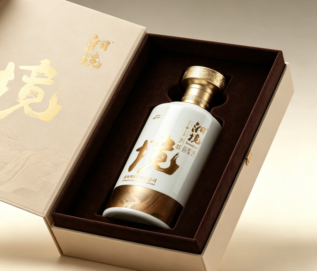
— Dongjing Yuanjiang Jiu beige gift box shown open, with velvet-lined interior, custom recesses, and gold-foil stamping on the lid
Four: flowing stone-grain bottle base—planting an “unexpected” detail.
About a quarter of the bottle base is a deep-brown flowing texture, like natural stone grain or wood grain, contrasting with the white porcelain glaze. The brilliance of this design is its sense of “surprise”: consumers expect a bottle that’s pure white all over, yet find a natural texture at the base, as if rock and porcelain were in conversation. An unexpected detail is a sophisticated expression of texture—it proves the designer put thought into places that aren’t meant to be seen.
Five: beige gift box and velvet-lined interior—turning “unboxing” into a ritual of trust.
The outer gift box uses a beige matte paper material, with the “境” character and a shallow relief of mountain patterns rendered in gold-foil stamping on the lid; the interior is lined with deep-brown short-pile velvet fabric, and the bottle is held firmly in place by custom recesses. The softness of the velvet, the snug fit of the recesses, and the matte feel of the lid together form a complete unboxing ritual. The moment consumers open the box, what they feel isn’t “this packaging is expensive” but “this bottle was treated with care”—and that feeling of being treated with care transfers, intact, onto the brand.
06
Chapter 5 Distilling the essence: perceivable brand personality is the anchor of trust
Having broken down the craft, let’s return to the core proposition: good packaging design = credible product texture + perceivable brand personality.
Credible product texture answers “is it worth trusting.” The warmth of white porcelain, the refinement of the reliefs, the grain of the sandy gold, the softness of the velvet—these real, touchable craft details replace all the empty adjectives like “premium, quality, craftsmanship.” Consumers no longer need to hear a brand say “how good we are”; what they hold in their hands is the answer. This is the perfect response to the “high quality doesn’t have to mean high price” era: use visible texture to prove invisible quality.
Perceivable brand personality answers “is it worth loving.” A single “境” character turns the brand from “a product under Jiugui Liquor” into “an expression with character.” The spirit of the running script is open-mindedness, the surprise of the stone grain is ingenuity, and the four treasures of the study in the desk scene are cultural depth—the brand is no longer an abstract logo but a “person” who can be perceived, discussed, and remembered. Just as a brand must learn to “be human,” packaging must too: with attitude, with detail, with warmth.
When both dimensions hold at once, packaging completes its leap from “product shell” to “trust carrier.” What consumers buy isn’t just a bottle of liquor but a confirmation of their judgment about the brand; what the brand gains isn’t just a single sale but a person willing to come back again and again.

— Dongjing Yuanjiang Jiu at a round banquet table, the social drinking atmosphere among dishes and cups
07
Conclusion: in an era of scarce trust, spend your ad budget on “real things”
The industry is going through a profound reshuffle: co-branding fails, creativity is scarce, traffic backfires, trust erodes. Brands are all looking for the next big trend, yet often overlook a simple truth—what’s scarcest isn’t more marketing, but more authenticity.
The answer Dongjing Yuanjiang Jiu offers is to spend the budget on “real things”: the porcelain glaze, the relief patterns, the sandy-gold brushstrokes, the velvet lining, the surprise of the stone grain. These craft details contain not a single ad slogan, yet they persuade more than any slogan could; they don’t chase instant traffic, yet in every touch, every unboxing, every banquet, they reinforce brand trust day after day.
The return to offline, real texture, candid personality—the marketing keywords of 2026 all point in the same direction: what consumers want isn’t to be persuaded, but to be proven to.
And packaging is the most honest, most enduring, most impossible-to-fake way for a brand to prove itself. When the false fire of marketing fades, what truly remains—picked up again and again, entrusted with trust—will always be the brands that put sincerity into real things.
This article is original content by Sanyao Packaging; the case images come from actual photography of Dongjing Yuanjiang Jiu.
Sanyao Packaging
Good packaging speaks
About This Case: Quick Answers
Are finishing processes on packaging (foil stamping, matte lamination, etc.) worth it?
Spending a few extra dimes to a dollar per bottle buys you a texture that lights up under the counter lights at a glance, and the gut feeling that "this bottle isn't cheap." Finishing isn't showing off technique—it's money spent to make consumers willing to believe it's worth the price, and that dollar comes back doubled in the selling price.
Can my baijiu products use this "good baijiu is worth making slowly" approach too?
Yes. This logic isn't picky about category—it works as long as your product looks about the same as everyone else's on the shelf and consumers can't recognize you in three seconds. When it comes to execution, we'll set a new plan based on your category, channel, and price band rather than forcing someone else's face onto yours.
What do you usually charge for baijiu packaging, and how long does it take?
We charge per project, depending on category complexity, the number of series, and whether prototyping and extensions are included. Typically 2–4 weeks: week one sets the direction and positioning, week two delivers the concepts, and weeks three and four refine, prototype, and finalize. Rush jobs can be compressed, but we recommend leaving time for physical prototyping. Send us your materials for a free diagnosis first, then we'll quote.
We're located elsewhere—can we collaborate online?
Yes. Many of our projects are remote collaborations: materials coordinated online, concepts reviewed in the cloud, and prototypes shipped by courier. There are no geographic limits—we work with clients nationwide.
CommentsBe kind, communicate rationally